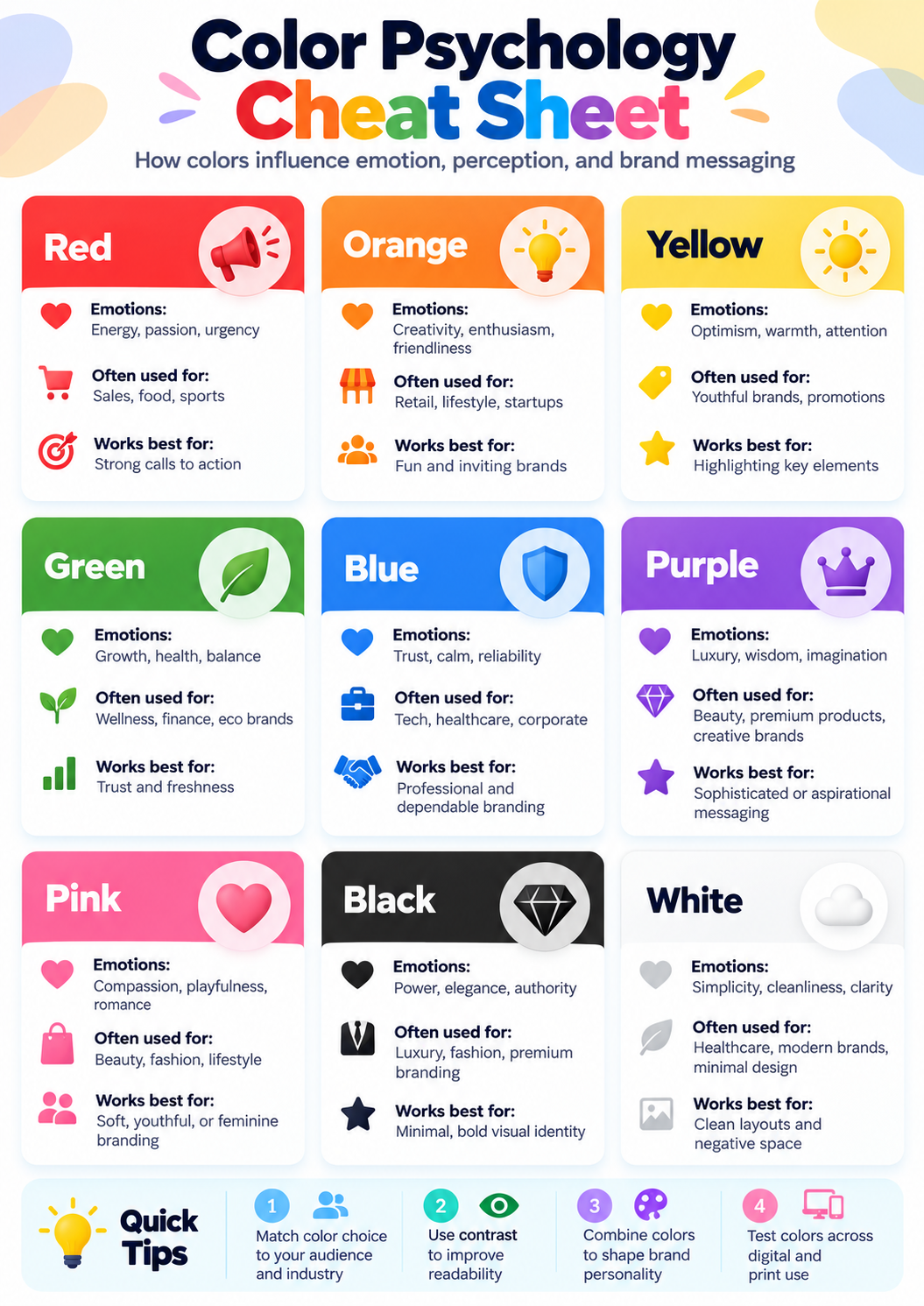
Color Psychology Cheat Sheet
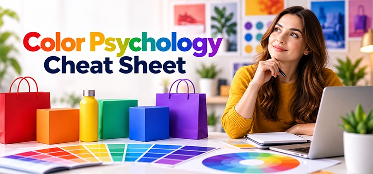
“A color psychology cheat sheet shows how each color affects feelings and actions. Brands use this guide to pick colors that match their message. The right color choice builds trust, grabs attention, and supports better photo editing services across every platform.”
Colors shape emotions before words do. A shopper feels something the moment they see a logo or a product photo. This feeling guides their next decision. A color psychology cheat sheet gives brands a clear map of these feelings. It shows which colors fit which goals. This article breaks down the real benefits of using color psychology guide for photo editing, branding and design work.
How Does Red Help Brands Grab Attention?
“Red creates energy and passion in the viewer’s mind. Brands use red to drive fast action and build excitement. This color works well for food, sports, and entertainment brands that want bold and urgent messaging.”
Red stands out in a crowded market. It pulls the eye faster than most other colors. Brands like Coca-Cola and YouTube use red to create a feeling of excitement and urgency. This color also supports call to action buttons. A red button often gets more clicks than a quiet gray one. Brands that want quick decisions from their audience often turn to red first.
How Does Blue Build Trust in a Brand?

“Blue signals trust, calm, and reliability to most viewers. Banks, tech firms, and healthcare brands use blue to feel safe and professional. This color choice helps serious industries build a steady and dependable image.”
Trust matters most in finance and health. A shopper needs to feel safe before sharing personal details or making a big purchase. Blue delivers that sense of safety. IBM, Ford, and PayPal all use blue for this exact reason. The color keeps a brand looking calm and steady, even during stressful moments like a bank transfer or a medical booking.
How Does Green Represent Growth and Balance?
“Green connects to health, harmony, and nature in the viewer’s mind. Wellness brands and finance companies use green to show growth and balance. This color also supports a fresh and sustainable brand image.”
Green feels natural and calm. It reminds people of plants, health, and steady growth. Starbucks and Whole Foods use green to show care for health and the environment. Finance brands also use green to suggest growth in money or investments. This dual meaning makes green a flexible choice across very different industries.
How Does Yellow Create Optimism in Design?

“Yellow brings happiness, hope, and positive energy to a design. Education and energy brands use yellow to feel bright and welcoming. This color choice works well when a brand wants to feel approachable and full of life.”
Yellow catches attention without feeling harsh. It gives off a warm and friendly feeling. McDonald’s, IKEA, and National Geographic use yellow to feel open and positive. Schools and energy companies also pick yellow for this same reason. The color tells the viewer that something good and simple is waiting for them.
How Does Purple Signal Luxury and Imagination?
“Purple connects to royalty, wisdom, and creativity in most minds. Luxury and creative brands use purple to feel premium and unique. This color choice helps a brand stand apart from common and ordinary designs.”
Purple carries a long history tied to royalty and wealth. This history still shapes how people see the color today. Cadbury, Twitch, and Hallmark use purple to feel special and creative. Beauty and luxury brands also lean on purple when they want to feel rare and high end rather than common.
How Does Pink Express Compassion and Warmth?

“Pink shows love, warmth, and nurturing care to the viewer. Beauty and lifestyle brands use pink to feel gentle and friendly. This color choice works well for brands that want to connect on a personal level.”
Pink feels soft and kind. It often connects with care, comfort, and gentle emotion. Barbie and Victoria’s Secret use pink to build this warm connection with their audience. Beauty brands use pink for the same reason. The color makes a brand feel approachable, especially to audiences looking for comfort and personal care.
How Do Black and White Balance Power and Simplicity?

“Black shows power, elegance, and authority in design. White shows purity, simplicity, and clean focus. Luxury brands use black for exclusivity while minimalist brands use white for peace and clarity in their overall look.”
Black and white sit at two ends of the same spectrum. Nike and Chanel use black to feel strong and exclusive. Apple and Dove use white to feel clean and simple. Both colors remove distraction. A brand picks black for bold confidence or white for calm clarity, depending on the message it wants to send.
How Does Gray Support a Professional Brand Image?

“Gray brings balance and neutrality to a design. Tech and automotive brands use gray to feel modern, calm, and professional. This color choice works well as a background or support color in a larger brand palette.”
Gray rarely leads a design, but it supports almost every design well. Mercedes-Benz and LG use gray to feel steady and modern. It balances louder colors in a layout without competing for attention. Many brands pair gray with a bold accent color to keep their design calm but still clear and organized.
How Do Teal, Indigo, Gold, Silver, and Coral Add Depth to a Palette?
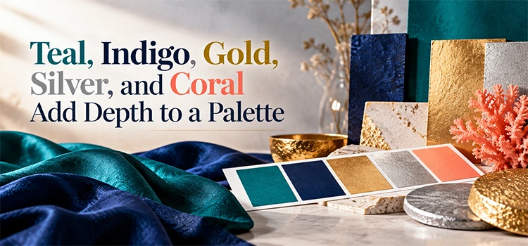
“Teal brings trust and balance, indigo adds wisdom, gold suggests success, silver feels modern, and coral brings energy and friendliness. Together, these colors give brands more range beyond the basic color wheel for deeper color correction choices.”
These five colors fill the gaps between the basic colors. Teal, used by brands like Tiffany & Co, blends calm trust with quiet confidence. Indigo, seen in Samsung’s branding, adds depth and intuition. Gold, used by Rolex, signals success and prestige. Silver, used by Apple, feels modern and innovative. Coral, used by Airbnb, feels warm and friendly. Brands mix these shades to add nuance that basic colors alone cannot offer.
Why Should Brands Use a Color Psychology Cheat Sheet?
“A color psychology cheat sheet helps brands choose colors with real purpose. It removes guesswork from design decisions and supports stronger branding. This guide also helps teams working with photo editing services keep visuals consistent and on message.”
Color choice should never happen by accident. A cheat sheet gives brands a clear reference before any design work begins. It helps teams stay consistent across logos, websites, and product photos. This consistency builds recognition over time. A shopper should feel the same way about a brand whether they see it on a website, an ad, or a product package.
Frequently Asked Questions
-
Why do colors affect how people feel about a brand?
Colors connect to memory and emotion in the brain. A person links certain colors to past experiences, nature, or culture. Brands use this natural link to create a feeling before a customer even reads the brand name or message.
-
Can one brand use more than one color from the cheat sheet?
Yes, most brands use a main color along with one or two accent colors. This combination creates balance and keeps the design from feeling flat. A good cheat sheet helps teams pick colors that work well together rather than clash.
-
Does color psychology work the same way in every country?
Not always. Some color meanings shift across different cultures. Red means luck in some regions and danger in others. Brands expanding into new markets should check local color meanings before finalizing a global design strategy.
-
How does color choice affect product photography?
Color choice affects mood, trust, and attention in a photo. A background or accent color should match the brand feeling. Many sellers work with photo editing services to adjust tones and keep every product image consistent with their chosen palette.
-
Why do tech brands often choose blue or gray?
Tech brands want to feel safe, modern, and reliable. Blue and gray both support that feeling without pulling too much attention. These colors also work well on screens, which matters for apps, websites, and digital interfaces.
-
Is gold always linked to luxury brands?
Gold often suggests wealth, success, and prestige, which fits well with luxury brands. However, some everyday brands use small gold accents to add a premium feel without committing to a fully luxury brand identity.
-
How many colors should a small business use in its branding?
Most small businesses do well with two to three main colors. Too many colors can confuse the brand message. A simple and focused palette helps customers remember the brand faster and builds a cleaner, more professional look.
-
Can color correction change how a brand’s photos feel?
Yes, color correction adjusts tone, brightness, and balance in an image. Small shifts in color can change how warm, cool, or energetic a photo feels. This step helps brands match their photos to their intended emotional message.
-
Why do food brands often use red and yellow together?
Red creates urgency and excitement, while yellow adds happiness and warmth. Together, these colors can increase appetite and attention. This is why many fast food brands combine both colors in their logos and store designs.
-
Should a brand change its colors over time?
Some brands update their colors as their audience or market shifts. A shift in color can signal growth or a new direction. However, most brands keep their core colors stable to maintain strong recognition over the years.