Typography in Photography: Importance, Principles & Tips

So, is typography all about complex things? Not at all, especially not for those who are creative enough in this area. But keep one thing in mind. If the picked typography goes wrong regarding the relevancy and design, it may hamper the entire beauty of photography.
Typography and photography are two different disciplines that have an outstanding intersection. While photography captures a moment in time, typography includes context, meaning, and personality in the visual illustration. The combination of these two spheres is ubiquitous, and when used efficiently, can build compelling and momentous images.
In this article, we will explore the significance of typography in photography, the fundamentals, and the techniques used to incorporate it. Also, we’ll share some examples of how it has been used successfully in various projects.
You may also read–
When to Use Typography in Photo?
Not necessary, you’ll always need to use typography with your photos. It depends. There are certain places where the utilization of this may bring some extra attention and value as well. On the other hand, it may look disturbing if you try putting typography in almost every picture you shoot.
So, what’s the ideal place to use it? It can be for various social media like Facebook, Twitter, and Pinterest. Apart from this, you can also implement this on YouTube thumbnails, wedding or photo albums, marketing materials, and branding.
Importance of Typography in Photography
Typography plays a vital role in photography, as it can either enhance or detract from the overall impact of an image. Let’s introduce some of the key importance:
- Typography can add context, mood, and personality to a photograph, making it more memorable and impactful.
- Effective use of typography can help convey a message, tell a story, or evoke emotions in the viewer.
- Typography can create a specific mood or feeling, such as a vintage or modern look, or guide the viewer’s eye to the intended focal point.
- Poorly executed typography can clash with the photograph and detract from the overall effect.
- Typography can provide a visual hierarchy that enhances the overall composition of the photograph.
- Successful use of typography in photography is evident in advertising, design, and editorial work, such as iconic posters, billboards, and magazine covers.
- Typography is a valuable skill for photographers and designers to master, as it can significantly impact the overall effectiveness of an image.
Principles of Typography
To effectively incorporate typography into photography, certain principles should be considered.
Typeface selection: Choosing the right typeface is crucial as it can set the tone and mood of the photograph. The typeface should be legible and match the message and intended audience.
Font size, weight, and color: The size, weight, and color of the font should be carefully considered to ensure readability and visual harmony with the photograph. The font should not overpower the photograph, and the colors should complement the image.
Placement and alignment: The placement of the text within the photograph should be carefully considered. It should not cover any important parts of the photograph, and the alignment should be consistent with the overall composition.
Use of negative space: Negative space, or the space around the photograph, can be effectively used to incorporate typography. This can create a sense of balance and harmony between the photograph and the typography.
Importance of contrast: Contrast can be used to create visual interest and emphasis in typography. You can achieve it through differences in font size, weight, color, and placement.
Tips for Using Typography in Photography
If we start listing the tips for better typography, we wonder where we would end. There are indeed many different ways you can use typography though all of them can’t bring perfection. We always suggest going simple and straightforward. The following tips will help you learn the best ways. Don’t miss them anyway.
1. Use the Standard Font

Yes, the first thing you have to remember always is to use a standard font. You might love to use a very tangled and decorative one. But are you sure that others can read what is written there easily? After going through the printer, the tangled font can be even more sulcated.
So, always make sure to use a clean and readable font. The beauty of the typography won’t get the viewers’ notice if they cannot read it. However, it is also essential to use one that fits your project perfectly.
Standard typography exposes both aesthetics and beauty. Your taste and personality will be exposed by your choice as well. So, you have to be extra careful while picking typography for your project.
2. Fewer Fonts in One Project

A project with many different fonts just loses its perfection. Always try to use one or two types of fonts unless the project is a big one. And make sure to be wise while choosing different fonts for one project. Indeed, choosing multiple fonts is one of the most challenging parts here.
Two or three fonts similar cannot get a perfect match. You shouldn’t go for three or more if it is not too much necessary. Also, it is important to use a big and more noticeable font for the keyword as well.
If you have a big project, it is better not to use much different typography in one small place. Indeed, using many typographies in a big project like a book doesn’t always look great at all.
3. Check the Contrast When Use Two or More Fonts

As we mentioned right before a moment, contrast is very important to check if you are using two or more fonts at a time. You have to be picky when selecting multiple fonts for a single project.
Keeping the fonts simple always looks overwhelming. Two overly tangled typography can never match side-by-side. If you have a part to prioritize, you should use a better font for that.
4. Look at the Color

And now, it’s about the color of the typography. In this case, you have to check the color of the project surface. Simply, you cannot use deep navy blue on a black surface. The color of the typography must be noticeable and looks great on the surface.
Very strong color contrast is very important just like the style of the typography. Generally, a black or any dark color seems legible and noticeable on a white or light bright color.
You can spend time on experiments in this case. Just apply different colors one after another and find out which one suits the surface color the most. The more you experience, the better your work will be.
5. Consistent Format Seems Good
Once you are done with the typography style, contrast, and color, you should check out the format. You must know that typography can be in different formats, such as bold, light, italic, etc. The size of the typography in photography also matters a lot.
For all the fonts and parts of your project, you have to select the appropriate format. For that, you have to read and understand what is written down there. Indeed, you have to find out the most important part of it and make it even more noticeable.
We also suggest not making it too small. Remember that the smaller font cannot get the viewers’ notice so easily. Also, you should learn the rules of using the Italic form when it is about an educational project.
6. Check Out the Alignment

Not just checking the format is sufficient. You have to make sure that the alignment of the text is perfect. The alignment means the side where the text starts. It can be left, or right. Also, how the body of the text is aligned with the project is essential to give a check.
If you ask us what to do, we always suggest going straight and simply. People may not get to the different alignments many times. So, you better make it straightforward to read.
7. Hierarchy Is Important

If you manage to learn how to create a hierarchy on your project typography, people will appreciate your work for sure. The visual hierarchy is all about the different types of colors, styles, and formats on different parts. It’s just as we said a minute ago. You have to read the project to find out its important part.
You can simply check out different projects to get more ideas about this fact. Just look through the newspaper, magazines, or journals. Having more ideas will help you get a sense of a better hierarchy.
Some Examples of Stunning Typography Photoshoots
Let’s have a look at some of the famous and ideal examples of typography where it’s been used smartly and professionally. Here’s a shortlist given below!

Source: AtlasComposer
Image Title: Composition blog accessories on white background. Blogger workspace.

Source: halfpoint
Image Title: Happy mothers day composition. Flowers on white background. Studio shot.
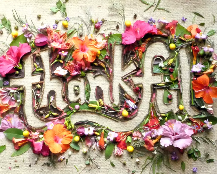
Source: twenty20photos
Image Title: Thankful, creative floral typography made with flowers.

Source: Rawpixel
Image Title: Final sale glittery shopping typography.
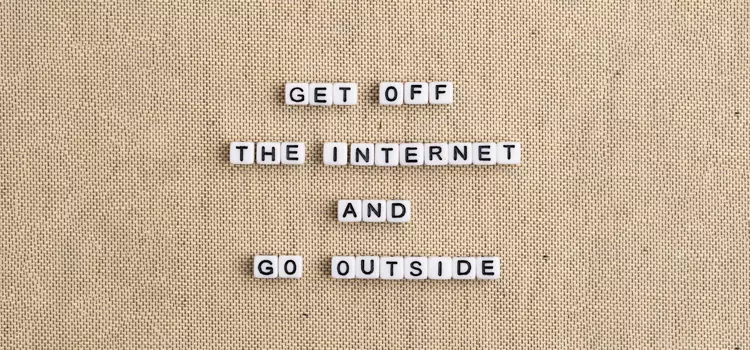
Source: Rawpixel
Image Title: HAPPY HOLIDAYS beads text typography
To Wrap Up
Typography plays an important role in photography and can significantly enhance the overall impact and effectiveness of an image. By considering principles such as typeface selection, font size & color, placement & alignment, use of negative space, and contrast, photographers and designers can effectively incorporate typography into their work.
Effective use of typography can add context, mood, and personality to a photograph, convey a message or evoke emotions, and create a visual hierarchy that enhances the overall composition. Conversely, poorly executed typography can detract from the overall effect and clash with the photograph.
In summary, you cannot overrate the importance of typography. When used effectively, typography can transform a photograph into a powerful communication tool that captures the viewer’s attention and leaves a lasting impression.