Standard Business Card Sizes | A Global Guide for Professionals
You’ve probably handed out a business card or carelessly tucked one into your wallet without a second thought. But here’s the thing: that small rectangle isn’t just any piece of paper – its size really matters a lot.
Too big, and it won’t slide into a cardholder. Too small, and it gets lost next to receipts and subway tickets. Across the U.S., Europe, Japan, and even in your local coffee shop meetups, there are unspoken rules about what “fits.”
Getting the dimensions wrong can ruin a great print job. This is true when designing your own layouts, whether for networking or for fitting custom photo sizes in a portfolio or promo kit.
Here’s a straightforward look at standard business card sizes. We’ll cover where they’re used, why they matter, and how to choose the right one easily.
Different Business Card Types
Let’s be real: most business cards look the same. White rectangle, black text, maybe a logo if you’re feeling fancy. But your card doesn’t have to blend into the stack; it can actually work for you. And that starts with picking the right type, not just the right size.
Here’s the lowdown on the most useful formats out there, and when each one actually makes sense:
The Classic Flat Card
This is your bread-and-butter card. Printed on sturdy stock (14pt or thicker), one or two sides, no frills. It’s what lawyers, accountants, and HR folks hand out, and for good reason. It’s cheap to print, fits everywhere, and says, “I’m professional, not trying to reinvent the wheel.” If your job relies on trust over flash, this is your move.
Double-Sided
Why waste the back? Flip it over and add a QR code that links to your calendar, a tiny map to your office, or even three quick client wins. It’s still a standard size, just a smarter use of space. Especially handy if you’ve got more to say but don’t want to hand someone a pamphlet.
Premium Finish Cards
Different finishes tell different stories. Spot UV makes your logo shine. Elegant textures evoke emotions. Investing in them is worth it for consulting, branding, or luxury services.
Square Cards
2.5 by 2.5 inches. No corners “leading” the eye left to right, it’s balanced, modern, unexpected. Photographers, designers, and boutique founders love these. Just don’t be surprised when someone says, “Oh, this doesn’t fit in my cardholder!” (Pro tip: carry a few standard-sized backups for traditionalists.)
Folded Cards = Mini Brochures
Skip the fluff. Tuck a real client quote, your go-to package, or a quick before-and-after right on the card. For wedding planners, coaches, and agencies, it’s proof, not promises, that gets you the next call.
Magnetic Cards
Imagine your client sticking your card right on their fridge or filing cabinet. That’s the magic of magnetic stock. Not for everyone, but if you’re a handyman, caterer, or local tutor, it turns your contact info into a household staple.
Eco-Conscious Cards
Recycled paper. Seed paper you can plant. Bamboo. Hemp. These aren’t just “green” checkboxes; they signal values. If sustainability is core to your brand (or your clients care deeply about it), this small choice speaks volumes.
Digital-First Hybrids
Your card looks normal… until they tap it with their phone. NFC chips, QR codes that launch your portfolio, even AR experiences, these bridge the physical and digital seamlessly. Perfect if your real “office” is online.
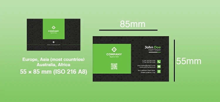
The Global Go-To: ISO 216 (A8) – 55 × 85 mm
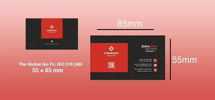
If you’ve ever exchanged cards in Paris, Berlin, Seoul, or São Paulo, chances are you held a card measuring 55 × 85 mm. This isn’t a coincidence; it’s the ISO 216 A8 standard, the de facto size across most of the world outside North America.
Think of it as a “metric” business card: small, neat, and fits well in wallets, passport sleeves, and card slots in notebooks. At about 2.17 × 3.35 inches, it’s a bit narrower and taller than its U.S. counterpart. This small difference impacts layout balance and how your logo appears.
Designers appreciate its clean ratio, which is close to the golden ratio. Printers like it too, as it reduces paper waste when cut from standard A-series sheets.
Pro tip: Use this size for international clients or global trade shows. It shows you’ve done your homework. Leave a 3mm bleed and keep important info 5mm from the edge.
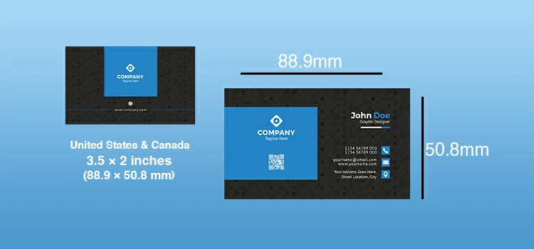
The North American Standard: 3.5 × 2 Inches (88.9 × 50.8 mm)
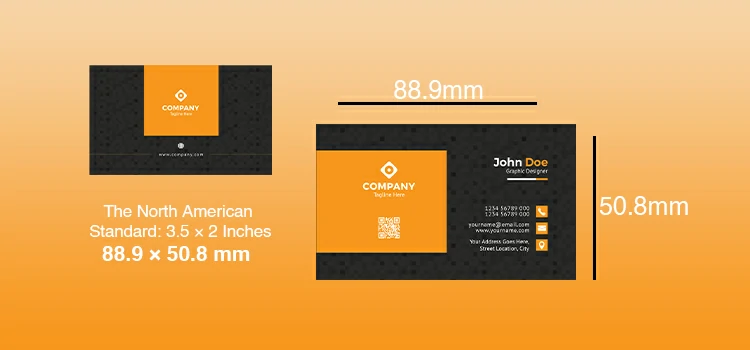
Step into any office from Toronto to Austin, and you’ll likely find business cards that measure 3.5 inches wide by 2 inches tall, roughly 89 × 51 mm. It’s the default size across the U.S. and Canada, baked into everything from Canva templates to local print shop presets.
This version is more “wallet-friendly” than the taller, slimmer ISO card. It sits well beside credit cards and driver’s licenses. The extra width allows for more room for logos or taglines. However, your layout must adjust for a shorter aspect ratio.
Well! “Standard” doesn’t mean standardized among printers. Check bleed margins (typically 1/8 inch) and the safe zone to ensure your design is secure before printing.
And if you’re mailing these in bulk? Stick to this size – it plays nicely with automated sorting machines and standard envelope inserts.
Bottom line: If your audience is primarily in North America, this is the safe, expected, and practical choice. Deviate only if you’ve got a strong reason, and a reliable printer who won’t charge you double for “custom” cuts.
Business Card Sizes Around the World – By Region
Regional preferences and creative outliers add depth, while ISO and North American standards lead. Here’s a quick, practical overview:
Europe, Asia (most countries), Australia, Africa
→ 55 × 85 mm (ISO 216 A8)
The global default. Fits international cardholders, aligns with A-series paper efficiency, and is widely accepted in professional settings.
United States & Canada
→ 3.5 × 2 inches (88.9 × 50.8 mm)
Slightly wider and shorter than ISO. Built into local printing workflows, stick with this if your audience is primarily North American.
Japan
→ 86 × 54 mm (JIS B7)
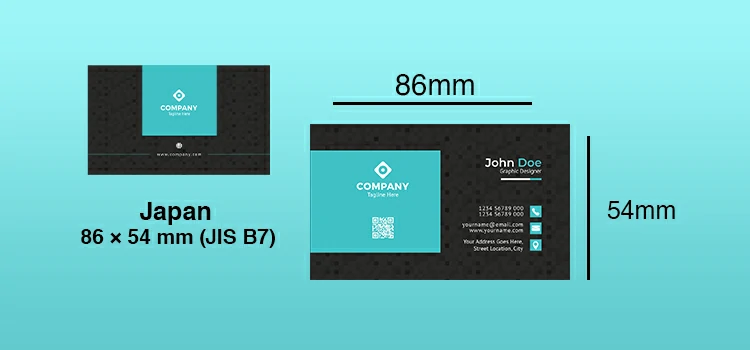
Slightly larger than ISO, this size reflects Japan’s emphasis on formality and precision. When doing business there, matching local norms demonstrates respect.
United Kingdom
→ 85 × 55 mm (same as ISO, but often listed width-first)
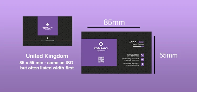
Functionally identical to the European standard, no need to redesign unless you’re nitpicking orientation.
Creative Industries (Global)
→ Square: 2.5 × 2.5 inches (63.5 × 63.5 mm)
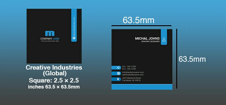
This standout piece is a favourite of designers, artists, and innovative startups. But it may not appeal to standard holders due to its visual flair.
Minimalist or Tech Startups
→ Slim: 3.5 × 1.5 inches
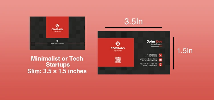
Modern style that risks being overlooked. Ideal for digital brands with bold visuals.
Luxury or Niche Brands
→ Custom sizes (e.g., 4 × 2 inches, rounded corners, die-cut shapes)
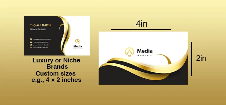
For special occasions like client gifts or flagship launches, custom sizes are the perfect choice. However, they are not ideal for mass production.
Design Tips That Actually Work—No Matter the Size
Your business card isn’t a life story. Keep it clear and easy to read, or it won’t make a good first impression.
Give it room to breathe: Don’t cram everything in. Leave space around your text, at least a pinky’s width from the edges.
Bleed? Yeah, it’s a thing, and you need it: If your background color or photo runs to the edge, it’s gotta go past the edge, just a sliver (about 1/8 inch or 3mm). Printers shift slightly when cutting. No bleed = awkward white slivers. And trust me, you’ll notice them.
Pick fonts like you’re texting your mom: If she can’t read it without squinting, it’s the wrong font. Save the artsy script for your wedding invite. On a business card, clarity beats cool every time. One clean typeface, maybe two if you’re disciplined. Bold for your name, regular for the rest. Done.
One thing should grab attention, not five: Is it your name? Your logo? A killer tagline? Choose one hero. Everything else plays backup. Too many “important” elements just cancel each other out.
Print a test copy, seriously: Don’t skip this. Print one. Put it in your wallet for a day. Hand it to someone in a coffee shop with dim lighting. Can they read your email? Does the QR code actually work? Real life isn’t a Photoshop mockup.
Minimal data = heightened action: So here’s a better way: just pick one way you actually want people to reach you. Maybe it’s your phone. Maybe it’s a simple email like hey@yourname.com. Or maybe it’s a link that takes them straight to your calendar or portfolio.
Try printing it in black and white: If it still makes sense without color, you’ve nailed the foundation. Color should add flavor, not carry the whole dish.
Suggested Article-
To Conclude: Size Matters, But So Does Smarts
Let’s wrap this up plainly: business cards aren’t going away. Not in a world where a real handshake (or even a thoughtful email follow-up) still opens doors that LinkedIn likes never will.
Yes, the “right” size depends on where you are—55 × 85 mm in Berlin, 3.5 × 2 inches in Chicago, maybe something slightly off-grid in Tokyo. But more than dimensions, what really counts is intention.
Are you making it easy for someone to reach you? Does your card match your work style and survive being passed on?
Choose a standard size if you’re uncertain. Keep the design simple. Focus on function over style. Remember, the best business card isn’t one that wins awards; it’s the one that gets used a week later.