How Better Product Photographs Drive E-Commerce ROI

If you want a clean path from traffic to revenue, start with better product photographs. Not because “pretty sells”, but because images answer the questions your customers are too impatient to type. And when you pair strong photography with smart photo editing services, you reduce doubt, increase add-to-carts, and cut costly returns at the same time. That is ROI in plain English.
Ecommerce is brutal because your customer cannot touch anything. So your visuals are not “creative.” They are your product’s interface.
Below is how to think about product photographs like a design expert: what they do, how they improve conversion rate, where they reduce friction, and what “modern” looks like in this year.
Why product photography is a conversion leverage, not a brand nice-to-have
On a product page, customers look for certainty. Images are the fastest way to create it.
- In Baymard’s product page usability research, 56% of test subjects’ first action on a new product page was exploring the product images before reading titles or descriptions.
- They also found 25% of ecommerce sites still fail to provide “sufficient” image resolution or zoom capability, which is a direct confidence killer.
That gap matters because your baseline conversion rate is not generous. Shopify cites average ecommerce conversion rates around 2.5%–3%. Small improvements compound fast.
When you improve product photos, you are usually improving multiple things at once:
- Clarity (what am I buying?)
- Risk reduction (will it look different when it arrives?)
- Fit/scale confidence (is this the right size?)
- Brand trust (is this store legit?)
- Decision speed (less scrolling, fewer bounces)
The ROI equation: how photos pay you back
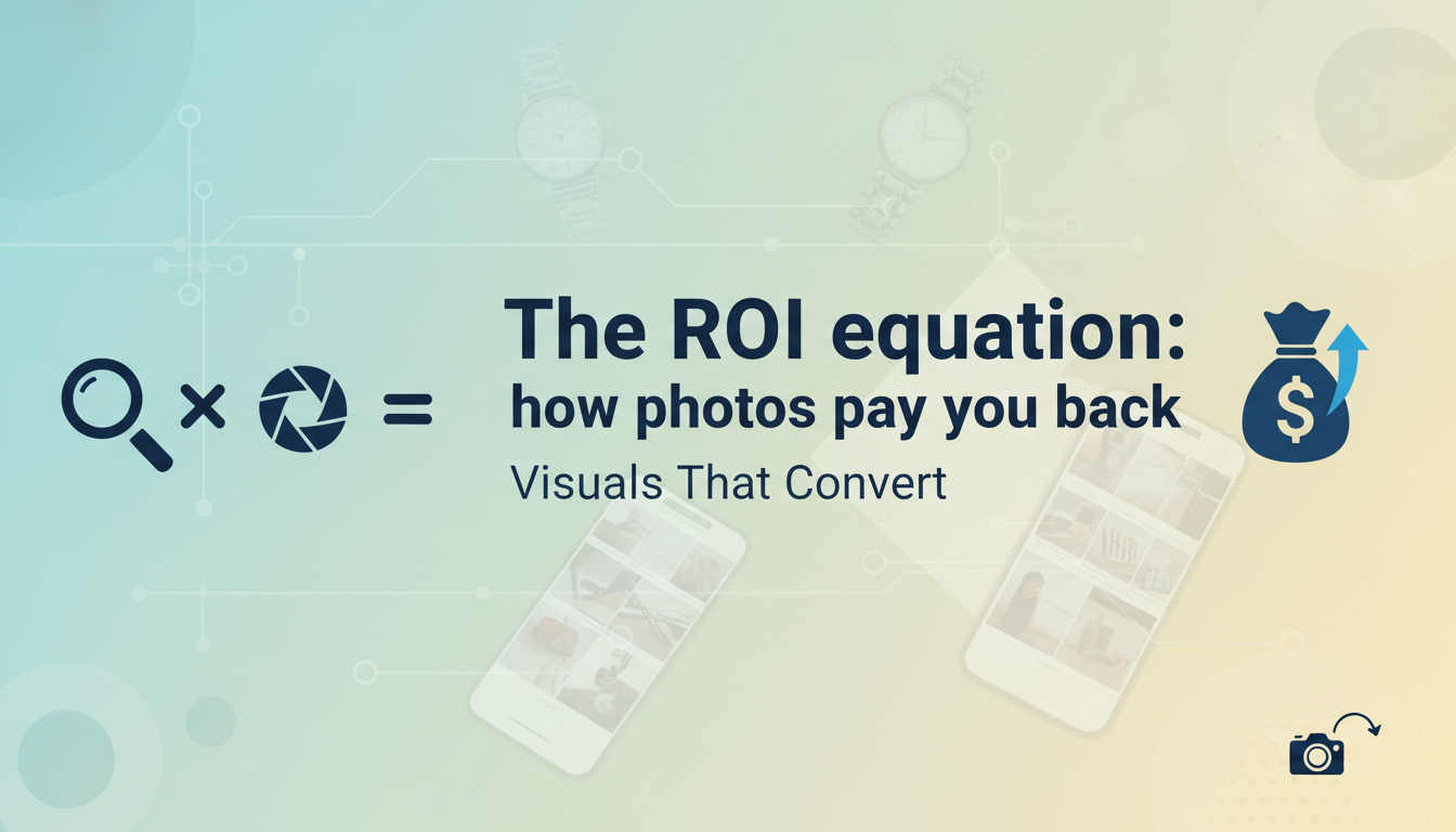
Think of product photography ROI across three buckets:
1) Conversion improve (more buyers from the same clicks)
If your product page removes doubt, more people buy. That is the obvious one.
2) Fewer returns (keep the revenue you already “won”)
Returns are not just shipping costs. They are:
- labor, restocking, repackaging
- damage/write-offs
- customer support time
- churn and negative reviews
One commonly cited pain point is “it looked different in the photos.” A survey referenced in ecommerce UX writing reports that 22% of customers returned items because the product looked different in person than in the photo.
Even if your exact number is lower, the direction is consistent: mismatched visuals create expensive returns.
3) Lower acquisition waste (your ads work harder)
When your product images are strong, you improve:
- ad engagement (especially in visual-first placements)
- landing page relevance and Quality Score signals (indirectly)
- post-click conversion, which lowers CPA at the account level
This is why creative teams and performance teams should share KPIs. Photos are not “top of funnel.” They are the funnel.
What “better” means in 2026: the modern product photography standard
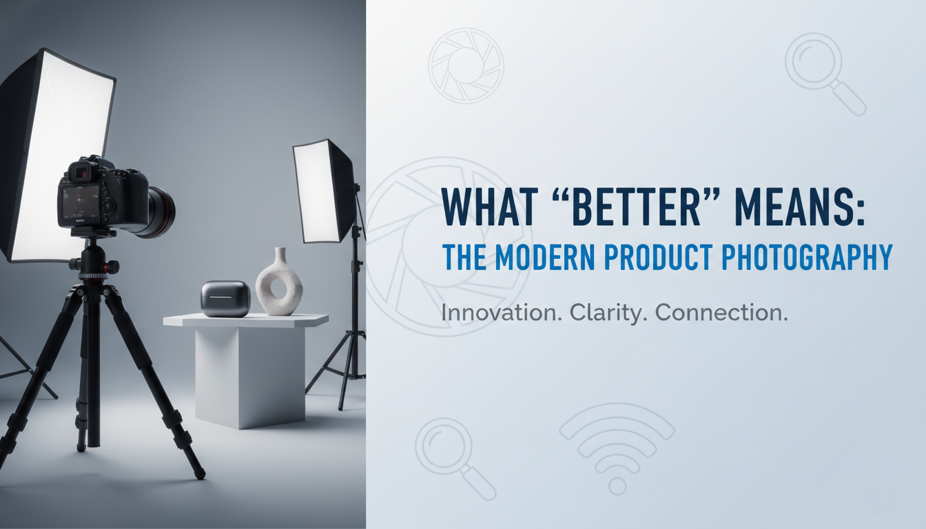
Most ecommerce brands do the basics: a white background image and a few angles. That is table stakes. Modern “better” is a complete visual system.
1) The confidence stack: 7 image types that sell
A high-converting PDP usually includes:
- Hero (clean, high-res, zoom-ready)
- Angle set (front, back, side, top, underside)
- Close-ups (materials, texture, stitching, print, ports, labels)
- Scale reference (in-hand, on-body, next to known object, or dimensions overlay)
- Context/lifestyle (use-case, environment, “this is how it fits in life”)
- What’s included (box contents, accessories, cables, inserts)
- Variants shown clearly (colorways, finishes, sizes)
That “scale reference” is not optional. Baymard’s research repeatedly shows users rely on imagery to establish size and fit.
2) Zoom that actually works
“Zoom available” is not the same as “zoom useful.” If your image resolution collapses at 2x, customers notice instantly.
Baymard’s finding that 25% of sites still miss sufficient resolution/zoom tells you this is still a real differentiator, not a solved problem.
3) Consistency across channels
Your customer might first see your product on:
- Google Shopping
- Amazon/Walmart/marketplaces
- Instagram/Pinterest
- comparison shopping pages
If your visuals are inconsistent, it creates “is this the same product?” doubt. Salsify’s consumer research messaging emphasizes that inconsistent or poor product content contributes to abandonment.
Data-backed behavior: why customers abandon without strong product visuals
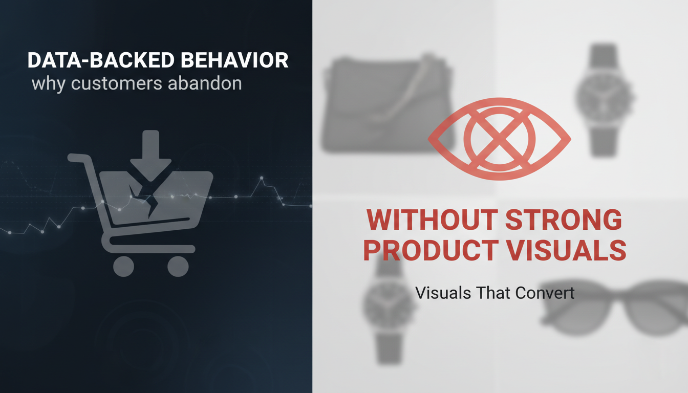
There are two hard truths about ecommerce buyers:
Truth 1: Lack of product info triggers abandonment
A retail consumer study summary reports half of consumers abandoned a purchase in the prior six months because they couldn’t find sufficient product information.
Truth 2: Images are part of “information,” not decoration
Salsify’s published research summary has said 30% of customers won’t purchase if images are missing or low quality.
This is why “just add more copy” rarely fixes conversion. If your photos do not answer the questions, customers leave.
The photo editing advantage: how editing turns good photography into revenue-ready assets
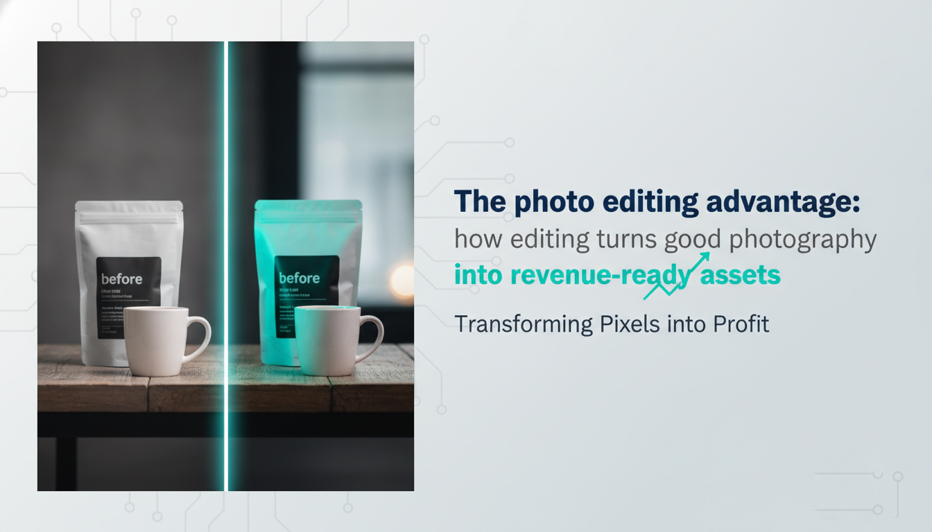
Photography captures the product. Editing makes it sellable at scale.
Here’s what photo editing services should actually deliver if ROI is the goal:
1) Color accuracy (and consistency)
Nothing destroys trust faster than “arrives different than expected.” Color accuracy requires:
- consistent lighting control
- calibrated workflow
- careful correction (especially for skin tones, cosmetics, fabrics, metallic)
2) Shape and geometry truth
Crooked horizons, warped edges, and lens distortion make products look cheap or “off.” Small fixes remove subconscious friction.
3) Texture preservation
Over-smoothing, aggressive noise reduction, and sloppy sharpening remove the very detail customers need to judge quality.
4) Background and shadow systems that match your brand
White background is not the goal. Clean is the goal.
- Natural shadowing helps products feel real
- Consistent floor/shadow direction improves professionalism
- For some categories, soft gradient backgrounds outperform pure white because they feel premium
5) Variant and set-building at speed
If you sell products with many SKUs, you are not “editing photos.” You are building a visual catalog system:
- consistent cropping rules, scale within category
- consistent naming and file structure, marketplace requirements
That operational consistency is where ROI multiplies.
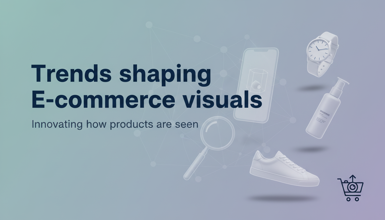
Trends shaping E-commerce visuals right now
1) Video is no longer optional on product pages
Wyzowl’s longitudinal tracking reports 91% of businesses use video as a marketing tool (with minor year-to-year fluctuations).
Product videos reduce uncertainty: movement, scale, and real-world use come through faster than text.
Practical direction:
- 10–20 second “show the product” clips
- close-ups + how it opens/works
- on-body/handheld scale
2) Visual search is pushing brands toward stronger imagery
Platforms are investing in visual discovery. Pinterest is explicitly pushing visual search and AI-assisted discovery experiences.
Translation: images are becoming inputs into shopping journeys, not just outputs.
3) Interactive shopping experiences (3D/AR/try-on) keep expanding
Google is promoting shopping features like 360-spin, 3D/AR, and try-on experiences for eligible categories.
Even if you are not doing full AR yet, the trend signals where “best-in-class” is heading: richer product representation and less guesswork.
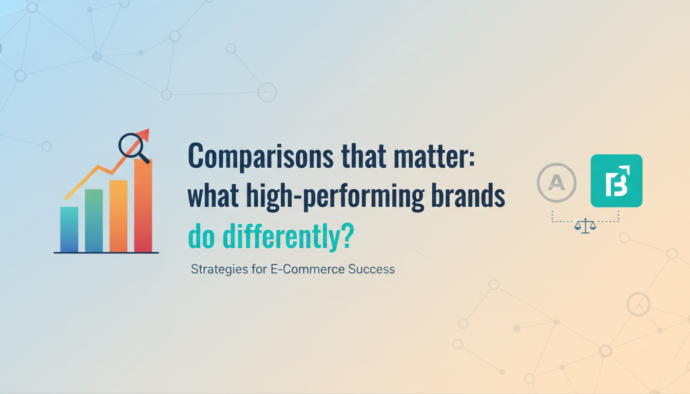
Comparisons that matter: what high-performing brands do differently?
“Average” product pages
- 3–5 images
- inconsistent lighting across SKUs
- weak zoom
- one lifestyle photo (sometimes)
- unclear scale
- editing that over-smooths or shifts color
“Conversion-first” product pages
- a deliberate image sequence that answers questions in order
- zoom-ready hero images
- detail shots that prove quality
- scale reference that reduces hesitation
- variant clarity (no surprises)
- consistent editing rules across the catalog
Baymard’s research makes it clear users engage heavily with images early, and missing fundamentals (like sufficient zoom) is still common.
A simple ROI playbook you can run this month

Step 1: Audit 20 best-selling SKUs
For each SKU, ask:
- Can a shopper confirm size/scale in under 10 seconds?
- Can they inspect detail/quality via zoom?
- Do images match the product in real life?
- Are variants shown clearly?
Step 2: Fix the “top 3 friction points” first
Most common friction points:
- No scale reference
- Weak zoom / low resolution
- Inconsistent color across shots and SKUs
Step 3: A/B test image sets, not just button colors
Test:
- adding 2–3 close-ups
- adding an “in scale” image earlier in the gallery
- replacing a generic lifestyle image with a use-case image
Because average conversion rates are often in the 2.5%–3% range, you do not need massive lifts to create meaningful revenue.
Final thought: product photos are your sales team
A great sales rep anticipates objections before the customer says them out loud. Better product photography does the same thing, silently, at scale.
If you take one idea from this: stop treating photos as a content task. Treat them as a revenue system. The brands that win in 2026 will be the ones that make product visuals more truthful, more inspectable, and confidence-building than the competition.