What Is Color Theory- A Comprehensive Guide
To beautify the visual world in the eye of an artist, understanding color theory is essential. It’s all about being familiar with the fundamental guidelines of using colors, their combinations, various types, meanings, color psychology, along with the impacts on different industries.
In these circumstances, we come with a comprehensive discussion about the terms in detail related to the theory of color. Hopefully, it will also help to improve the idea of choosing the best color scheme for your project.
Table of Contents
Meaning of Colors in Color Psychology
Mystery of Beautiful Color Combinations
What is Color Theory?
The presence of color is everywhere in our lives, from personal to professional areas. That’s why it needs a proper understanding of color theory. But what is color theory? Well! Let’s be straightforward to define it! It refers to the rules of using color in different segments of life in terms of fields, purposes, and psychology.
In other words, it’s the way to define the logical structure of color in various perspectives so that it helps to create aesthetically pleasing visuals. This is both science and art, which explores the methods of the color wheel, context, and harmony to interact with people with strong messages.
Why Should We Care This?
Before defining the complex elements of color theory, we should have the appropriate cognizance of this subject. Well! There are multiple reasons why you should be sincere about the rules of colors and the ways of using them properly. It’s not like you deal with the elements in the same strategy all the time.
Whether you are making a website, using the color schemes may differ from a logo or advertising design, painting, or other fields. Besides this, it needs the sense and creativity of using the appropriate color model (RGB or CMYK) that will bring the appeal and artistic image.
Have you ever thought why the marketing and ecommerce giants are investing millions of dollars in the best design and color? It’s the main object that is closely related to the visual identity of a brand or product. In some cases, the entire flavor of a project depends on the taste of color.
With an excellent color combination, object recognition becomes easier for the audience. It reflects the materials along with the meaning. The more you explore the meaning of your creativity, the more you create engagement with the people for whom you are giving all your efforts.
Colors can create an impression of your personality and an emotional connection as well. As a result, the opportunity grows to establish a community of the same views and values. Thus, it differs from your competitors and makes your artwork remarkable.
Types of Color
Colors are categorized into three basic types likely primary, secondary, and tertiary. Apart from these, there are also some more. Let’s define them with proper examples!

-
Primary Colors
Primary colors include red, blue, and yellow, and these are created through natural pigments. It cannot be produced by mixing multiple colors. These are also recognized as the fundamentals of human vision. Furthermore, all other colors belong to at least one of the primary colors.
-
Secondary Colors
To get secondary colors, you need to mix up any two of the primary colors in equal proportions. It includes green, purple, and orange. In this way, the mixing of blue and yellow creates green, red and blue create purple, and yellow and red create orange.
-
Tertiary Colors
Tertiary colors come from primary and neighboring secondary colors. This is also called an intermediate color. The colors formed in this way are likely yellow-orange, yellow-green, blue-green, blue-purple, red-orange, and red-purple.
-
Warm Colors
Warm colors bring the effect of warmth. These are made from red, orange, yellow, and the combination of the colors. This one is categorized on the basis of color effects and used to make things closer and explicit in an image.
-
Cool Colors
To bring cool and soothing feelings in images, this type is used through green, blue, and purple, along with the variations of these colors. This is just the opposite of warm colors in nature. It makes things far in images or paintings.
-
Neutral Colors
Another category comes with neutral colors that include black, white, gray, beige, and brown. These are also known as ‘earth tones’. The expressions of this genre depend on the surrounding colors in an image. Neutral colors are created by adding a pure color to black, white, or gray.
Understanding Color Models
Color model is a term that specifies a system to measure colors using the primary components. It has multiple types, including RGB, CMYK, CIE, YUV, and HSL. Among them, RGB and CMYK are recognized as the basic models that are used widely in various professional purposes.

-
RGB Color Model
The RGB model uses Red, Green, and Blue as its primary components, which are mainly applied in screen-based designs. It’s also known as the additive color model because it creates colors by mixing transmitted light.
To each of the colors, a number or value is assigned from 0 to 255. If you expect to have purely blue, the value of red and green must be 0, and blue should have a value of 255.
-
CMYK Color Model
In other words, this one is also called a subtractive color model, which is just the opposite of RGB. This model is mostly used in printing through the components, including Cyan, Magenta, Yellow, and Black. You can use the CMYK model for branding, advertising, and merchandising purposes. In this case, the best formats are likely PDF, AI, and EPS.
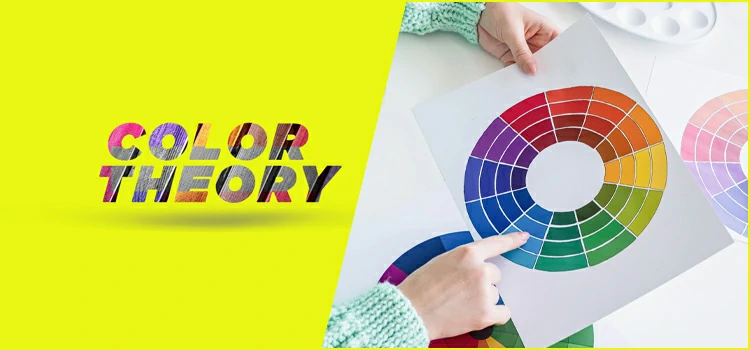
The Color Wheel
Designers, creative contrivers, and artists are making mind-blowing color combinations, and the best way they follow for that is the basic theory of color. To explain colors and the relationship between colors, science is used to describe them. Here, the color wheel is the most important part, which is another Innovative idea first explained by the great Isaac Newton in 1666.

The color wheel is mainly an absurd circle of colors that maps the color spectrum to show the differences and relationships between colors. It shows how primary colors mix to form a secondary color. The color wheel is very important in this case, as it’s used to find the combinations.
There are mainly two types of color wheels, which are the RYB color wheel and the RGB color wheel. RYB is the combination of red, yellow, and blue, where RGB is for red, green, and blue. The first one is normally used by the artists, while the second one is used for technical purposes.
Meaning of Colors in Color Psychology
Psychology has a separate part in the color that we know as color psychology. It mainly studies the effect of color on human behavior. The most used sector of this term is business branding and marketing. We see yellow color in most of the restaurants, and it is an example of that, as the yellow color makes us hungry.
Like that, every color has some specific effects on human behavior. Red color stands for love, expensive, lust, while blue indicates quality, reliability, and competence.
Again, the green color symbolizes health, safety, and eco-friendliness. That’s how all other colors have their respective effects on human behavior. And all these facts are studied in color psychology.
Basic Color Schemes
To understand the color scheme, we mean the logical color combinations. There are 5 basic categories that are mentioned below.
-
Complementary
The complementary color scheme uses two colors on the color wheel that are positioned exactly opposite each other.
-
Monochromatic
A color in the wheel can have several shades and tones. The monochromatic color scheme indicates different shades or tones of the same color.
-
Analogous
On the color wheel, designers place three to five colors that sit next to each other to create the analogous color scheme.
-
Triadic
In the color where we can find 3 colors that are evenly spaced and provide a high contrast color scheme. These three colors generally form the Triadic or triangle color scheme.
-
Tetradic
Unlike the Triadic color scheme, it is all about the four colors evenly spaced in the Tetradic or square color scheme. When the wheel includes more colors, it will be difficult to maintain a balance between this type of scheme.
Mystery of Beautiful Color Combinations
In color theory, we use the color wheel to find out the color harmony. By this, we mean beautiful color combinations. Though color schemes indicate logical formations, we often avoid the rules to form different but beautiful combinations.
Most of the time, people use natural color combinations in different projects. For example, a blue sunset indicates dark blue with orange or red. Light sea beach indicates rustic tan or beige for the sand and sea green or turquoise for the seawater. Also, artists use different creative ways to form beautiful compositions.
Color Tools for Designers
Whether you are a designer in the graphics or web industry, you must be familiar with various color tools. In this part, we come up with some of the best choices that will make your designing job more comfortable.
- ColorPick Eyedropper
ColorPick Eyedropper is a free Chrome extension to identify the color code of any element from any source on the web. It’s highly configurable and easy to use. You will get quick access to the sources to get inspiration from the site you browse online.
- Colors & Fonts
It’s an amazing tool to find colors and typography combinations so that you get a smooth workflow for your design project. You will find a lot of helpful resources such as color palettes, gradient patterns, material & tailwind colors, and a color converter. It’s a great tool for both web and digital designers as well.
- Webflow Chrome Extension
This one is extremely easy to use and a helpful tool for designers to pick the right color to design any element of your choice. Just activate, choose, and use the best thing that suits your project.
- ColourCode
Another free tool comes to showcase the color code with your cursor movement. You can easily pick the right one from different palettes, including triad, quad, monochrome, etc. Also, it lets you have options to create amazing combinations.
Colors and Branding

Is there any connection between the colors and branding? Well! Each color has its unique power to deliver a strong message.
For this, it needs to understand the psychology of color that helps to build trust with the audience. All in all, to increase brand recognition and user interactions, the use of the proper colors has no alternatives.
To Wrap Up
Color theory is all about learning and maintaining the guidance of using colors, their types, models, color psychology, schemes, and more related to this global term.
We can’t avoid the impact of colors in different spheres of our personal and professional lives. Hopefully, this discussion will help you make sense of using the appropriate tone of color for your project.