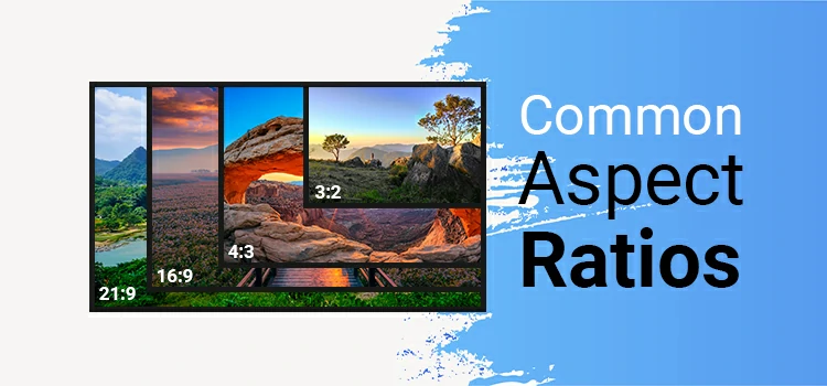
Common Aspect Ratios Explained (with Calculator)
You’ve seen it before, those black bars on the sides of an old movie or a vertical video that takes over your screen. That’s aspect ratio at work. It’s not just tech jargon. It’s the invisible force shaping how you experience every photo, film, and social media scroll.
Aspect ratios evoke emotions on every screen. We remember classic 4:3 TVs and epic 2.39:1 screens. TikTok’s vertical clips also stir feelings. Each ratio presents a unique view.
In this post, we’ll explore common aspect ratios. We’ll look at where they’re used and why the right choice matters. Let’s turn the frame into your secret weapon.
Aspect Ratio Calculator
Enter width/height or choose from common formats. See how your frame looks in real time.
Tip: Type one side while “Lock ratio” is on to auto-fill the other.
Visual representation only — not actual resolution
—
Most Common Aspect Ratios Explained
You don’t need a film degree or a £50,000 camera to grasp aspect ratios. You need to know what works and why some frames catch your eye while others fade away. Let’s explore aspect ratios, key to photography, videography, and digital sharing.
1:1– The Square That Stopped Scrolling
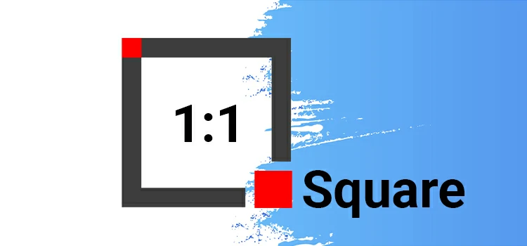
Remember Instagram’s early days? No Stories, no Reels—just a clean grid of square posts. That was 1:1. And it wasn’t just a design choice; it was a statement.
Popular for Instagram feeds, album covers, and product shots, this format forces balance. No wide distractions. No tall emptiness. Just center-frame focus.
Why it works:
– Perfect for symmetry, minimalism, and centered subjects.
– Ideal when you want your photo or ad to stand out in a sea of vertical clips.
– Feels intentional. Like you planned it, not just snapped it.
Best uses:
✔️ Social media thumbnails
✔️ E-commerce product images
✔️ Quote graphics
3:2– The Original Photographer’s Frame
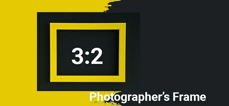
This is where digital photography began. If you’ve ever used a DSLR or mirrorless camera, chances are your sensor natively shoots in 3:2, a legacy from 35mm film. It’s slightly rectangular, giving you room to breathe on the sides without losing focus on your subject.
Here’s why 3:2 works so well:
– It matches the way your eyes naturally take in a scene—balanced, wide enough to breathe, not too stretched.
– Perfect for landscapes (hello, golden-hour horizons) and portraits (plenty of headroom and footing).
– And when it’s time to print? No fuss. Slides right into common photo sizes like 4×6 or 8×12 without awkward cropping.
Best uses:
✔️ Street shots
✔️ Documentary work
✔️ Print-ready images
4:3– The Quiet Workhorse
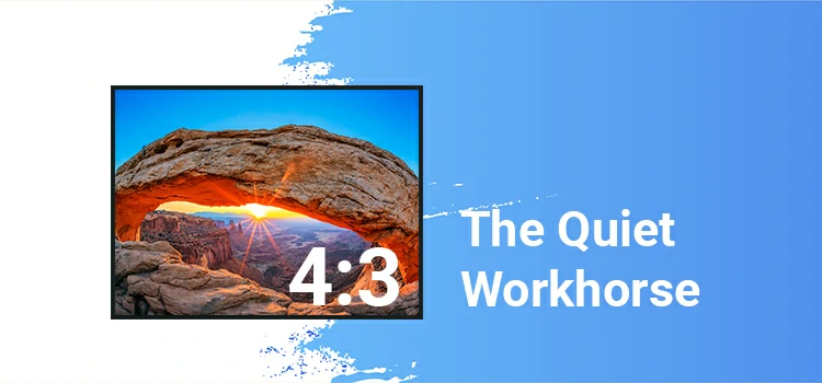
Older iPads. Micro Four Thirds cameras. Early smartphones. Many point-and-shoots. They all love 4:3. Slightly boxier than 3:2, this ratio feels stable. Grounded. Think of old family photos or school presentations—this is that frame.
Why it works:
– More vertical space than widescreen formats. Great for single-subject framing.
– Excellent for documentation, vlogging, and indoor photography where space is tight.
– Still widely used in security cams, drones, and tablet screens.
Best uses:
✔️ Casual snapshots
✔️ Educational videos
✔️ Product demos
✔️ Behind-the-scenes content
16:9– The King of Online Video
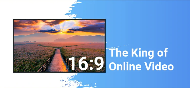
You’ve glimpsed 16:9 a thousand times, haven’t you? It graces YouTube, Netflix, Zoom, and most screens today. Perfectly proportioned, it’s not too wide nor too narrow. This format is primed for videos, vlogs, and daily viewing delights.
Its ubiquity? A testament to its triumph, it simply works! Familiar and functional, it’s tailored for our modern viewing habits.
Why it dominates:
– Fits almost every modern screen perfectly.
– Wide enough for dynamic movement, narrow enough to keep faces clear.
– Built for storytelling with context—show someone walking down a street and the city around them.
Best uses:
✔️ YouTube videos
✔️ Tutorials and reviews
✔️ Webinars and live streams
✔️ Digital signage and presentations
9:16– The Mobile-First Powerhouse
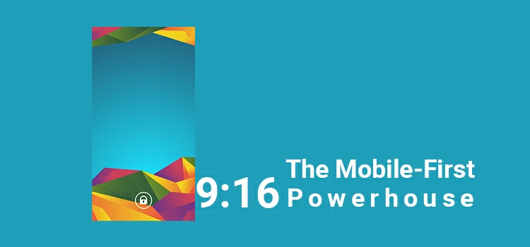
Hold your phone upright. Now imagine a video filling that entire screen. That’s 9:16—the full-screen vertical format behind TikTok, Instagram Reels, and YouTube Shorts. Once laughed at (“No one watches videos like that!”), Now it owns attention spans.
Why it exploded:
– Takes over the entire mobile display. No black bars. No distractions.
– Puts faces, text, and action front and center.
– Matches how people naturally hold their phones—swiping up, not sideways.
Best uses:
✔️ Short-form video content
✔️ Personal vlogs and reactions
✔️ Quick tutorials (e.g., makeup, cooking hacks)
✔️ Ads made for mobile users
Cinematic Ratios(21:9, 2.39:1, 2.35:1)– The “Wow” Factor
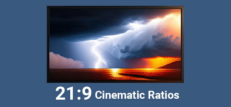
The music swells, the screen expands, and you’re transported. At 2.39:1, the frame doesn’t just show a scene; it invites you into one. Wide-open spaces stretch further. Silences hang heavier. Even stillness feels charged.
Big films like Dune and Top Gun: Maverick use this look for a reason. It turns simple moments into something larger than life.
Why they feel cinematic:
– Massive horizontal space for sweeping landscapes, dramatic silhouettes, and slow tracking shots.
– Creates isolation—even in a crowd, a character can feel alone.
– Triggers that “this is important” feeling in viewers.
Best uses:
✔️ Short films and indie projects aiming for drama
✔️ Music videos with visual ambition
✔️ Brand films wanting premium polish
✔️ Trailers and teasers
5:4 and 7:5– The Print & Gallery Favorites
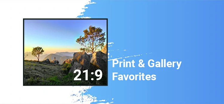
Step into a photo gallery. Look at fine art prints or professional portraits. Chances are, many are framed in 5:4 or 7:5 ratios tied to medium format cameras and classic printing standards.
Why creatives love them:
-Just taller than 3:2—more room for breath and light above the face.
-Fits 8×10, 11×14 frames perfectly. Classic. Clean.
-Rare online. Feels intentional. Stands out in a scroll.
Best uses:
✔️ Portrait photography (especially studio work)
✔️ Wedding albums
✔️ Art exhibitions
✔️ Editorial features with print distribution
Directors Who Weaponize Aspect Ratio
Most filmmakers use aspect ratio like a camera setting—something technical, automatic, forgettable. Then there are the rebels. The ones who treat it like a weapon.
They don’t just shoot in widescreen or go vertical for fun—they change ratios mid-film to mess with your head, shift timelines, or make you feel exactly what the character feels. No filters. No dialogue. Just pure visual psychology.
Let’s talk about a few masters of the craft.
Wes Anderson– The Time Traveler in Frames
In The Grand Budapest Hotel, Anderson doesn’t just tell different eras—he shows them through aspect ratio.
- 1930s? 1.37:1 (almost 4:3), mimicking old cinema.
- 1960s? 1.85:1, cleaner and wider.
- 1980s? 2.35:1, full cinematic sweep.
You don’t need a calendar to know when you are. Your eyes feel the shift. It’s subtle. Brilliant. And so Anderson—every detail intentional, every frame a painting that evolves.
Christopher Nolan– The IMAX Gambler
Nolan plays with your senses in ‘Dunkirk’. He switches between 2.39:1 and IMAX 1.43:1 to create a rhythm. The tall frame pulls you into chaotic beach scenes. Then, in the cockpit, it narrows. Everything tightens.
Your breath slows. The tension spikes. You don’t just watch the war, you feel it in the shape of the screen. That’s not tech. That’s storytelling at its most visceral. He’s not just showing war. He’s making you live it through the shape of the screen.
Charlie Kaufman– The Mind Bender
In I’m Thinking of Ending Things, nothing is stable—including the frame. The film subtly shifts aspect ratios as reality blurs. Is this a memory? Fantasy? A dream within a dream?
You can’t pin it down. And that’s the point. Kaufman uses the changing frame like a whisper in your subconscious: Something’s off. Pay attention.
Robert Eggers– The Folklore Architect
Robert Eggers uses a tight 1.19:1 frame and harsh black-and-white to trap viewers in ‘The Lighthouse’. Close-ups and stormy weather create an oppressive atmosphere.
You’re not just watching two sailors descend into madness. You’re right there with them, losing grip, breath by breath. The screen doesn’t show insanity; it makes you feel it. That tight, boxed-in frame? It’s not a choice. It’s a prison.
Social Media Storytellers– The New Wave
Let’s shine a spotlight on today’s unsung visionaries: TikTok creators, Instagram artists, and YouTube Shorts directors. They embrace 9:16, not for the fashion, but because it truly delivers.
A face filling the vertical screen feels personal. Immediate. Like someone’s confessing directly to you. Some even switch from vertical to horizontal mid-video to shock the viewer: “Wait, this isn’t what I expected!”
Choosing Your Frame: Practical Tips for Creators
Picking the right aspect ratio shouldn’t feel like solving a puzzle. You’re not just making content. You’re guiding attention, shaping emotion, and fighting for three seconds of someone’s scrolling life.
So choose smart. Choose on purpose. Here’s how to pick the right frame without overthinking it.
Filmmakers & Video Pros
Think like a painter. What’s your canvas say about the story?
– Use 2.39:1 for epic scale, isolation, or high drama. (Think deserts, war zones, lone heroes.)
– Go 1.85:1 for character-driven scenes—dialogue-heavy films, intimate moments, realism.
– Try 4:3 if you want tension, nostalgia, or to trap your subject. It feels focused… maybe even suffocating.
– And don’t be afraid to change ratios mid-story (like Anderson or Nolan). It shocks, signals a shift, and sticks.
Content Creators (TikTok, Reels, Shorts)
Your audience is mobile. Vertical is non-negotiable.
– 9:16 is king. Fill the screen. Put faces top-center. Add bold captions. No dead space.
– But here’s the pro move: shoot in higher resolution (like 4K) and crop later. That way, you can repurpose one clip into vertical and horizontal—no reshoots needed.
Photographers & Social Visuals
One image, multiple lives. Plan ahead.
– 1:1 (square) works best for Instagram grids, product shots, and minimalist art. Clean. Balanced. Eye-catching.
– 16:9? Great for banners, YouTube thumbnails, website headers—anything wide and clickable.
– Want drama? Shoot tight in 4:3, then crop to 16:9 or 9:16 later. Gives you flexibility without losing focus.
The Future of Framing: What’s Next?
Let’s be honest—aspect ratios used to be simple. One screen, one standard, one way to frame a shot. Not anymore. We’re living in a world where someone might watch your video on a 65-inch OLED, then rewatch it on AirPods with their eyes closed.
Where a film starts in cinemascope and ends up cropped into a TikTok stitch. Where your phone folds open like a book—and suddenly, the “screen” has no fixed shape at all. So what happens to the aspect ratio when the rules keep changing?
Spoiler: It gets smarter, messier, and more personal than ever.
Foldables Are Breaking the Mold
Phones like the Samsung Galaxy Z Fold or Google Pixel Fold aren’t just bigger—they transform. One second, you’re scrolling vertically. Next, you unfold it and boom: wide-screen mode.
So do you make two versions of your content? Or one that adapts in real time? Brands and creators are already testing dynamic videos that shift layout as you open the device. The frame isn’t fixed; it evolves.
AI Is Redefining the Frame
Picture uploading a 16:9 video. The AI then reframes it for TikTok, YouTube Shorts, and Instagram, keeping the subject centered.
That’s already happening. Tools like Runway, Pika, and even Canva now use AI to track motion, zoom intelligently, and crop emotionally, not just technically.
Soon, your video won’t have one aspect ratio. It’ll have many—each tailored to the viewer’s device, behavior, even mood.
Cinematic Flexibility Is Coming
Films like Dune and Tenet gave us glimpses: IMAX tall frames cutting into widescreen chaos. What if stories flowed between ratios? Not as a gimmick, but as part of the narrative rhythm.
Imagine this: A wide desert stretch at 2.39:1, endless sky, lone figure walking. Then, no cut… the frame slowly narrows. Edges creep in. The screen tightens to 4:3. The world feels smaller. Claustrophobic. Just like the character’s panic. No edits. No jumps.
The Web Is Going Shapeless
On modern websites, videos don’t just sit in boxes. They stretch, float, wrap around text, and respond to scroll. Square, vertical, panoramic—the “right” ratio now depends on where it appears.
And with AR/VR creeping into daily life, we’re heading toward formats that aren’t flat at all… but spatial. You won’t watch a video; you’ll step inside it.
To Conclude
The right aspect ratio gives your video a cinematic look. It also makes photos professional and designs stand out on all platforms. Vertical videos, widescreen films, and Instagram posts each require specific formats for the best impact.
Select the right aspect ratio for your project to boost your creativity. Smart choices enhance engagement, improve visual appeal, and strengthen your brand. Let your designs stand out and capture your audience’s attention!
Frequently Asked Questions
1. Best YouTube ratio?
16:9. It fills the screen and looks pro.
2. Instagram ratio?
- Feed: 1:1 or 4:5 (4:5 shows more).
- Stories/Reels: 9:16—full screen on phones.
3. Can I change the ratio without losing quality?
Yes, if you crop carefully and export at high quality. Don’t stretch the image.
4. Why black bars on my video?
Your video’s shape doesn’t match the platform. Use the right ratio to fix it.
5. Cinematic look?
Try 21:9 or 2.39:1. That wide, movie-theater feel.
6. Do ratios affect engagement?
Yep. Videos that fit the screen hold attention better, with no awkward gaps or tiny playback.
7. Best print photo ratio?
3:2, 5:4, or 7:5. They match common frame sizes and keep your whole shot.
8. Is 9:16 just a trend?
Nope. People watch on phones; vertical is here to stay.