Best Font for Flyers: 30 Picks That Actually Work (With Pairings)
If your flyer is getting ignored, the font is often the silent killer. People don’t “read” flyers first. They scan them. Your type has to communicate the offer, the vibe, and the next step in a split second.
This guide gives you category-based font picks that are reliable for real-world flyers: events, promos, business services, luxury brands, and local offers. You’ll also get ready-to-use pairings, so you stop guessing and start designing faster.
What Makes A Flyer Font a “Best” Font?
A flyer font is “best” when it does three jobs well:
- It reads fast from a distance. Your headline should be legible at a glance. If someone needs to squint, you already lost.
- It creates a clear hierarchy. Headline, key details, and CTA should look obviously different without looking chaotic.
- It matches the context. A nightclub flyer and a law firm flyer can’t share the same personality.
- It prints cleanly. Thin strokes, overly decorative letterforms, and tight spacing often fall apart in cheap printing.
- It’s available and legal. Great fonts are useless if you can’t license them for commercial work.
Now let’s get to the fonts.
Best Headline Fonts for Flyers (big, readable, confident)
Bebas Neue
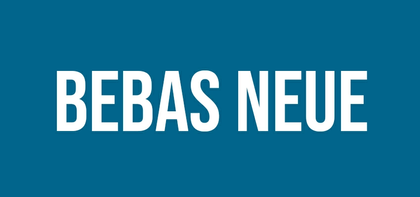
Tall, condensed, and built for headlines. It looks sharp on event flyers and posters where space is tight. Pair it with a simple sans-serif body font so the headline stays the hero, not the whole design.
Anton

Anton is bold and wide, with a “sale sign” energy that still feels modern. It’s perfect when your flyer has one main promise: discount, launch, grand opening, or limited-time offer. Keep spacing slightly open to avoid heaviness.
Oswald
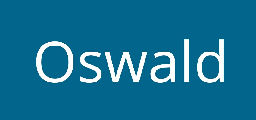
Oswald is a cleaner alternative to classic condensed fonts. It’s strong and works well for events and promotions, even in all caps.
League Spartan
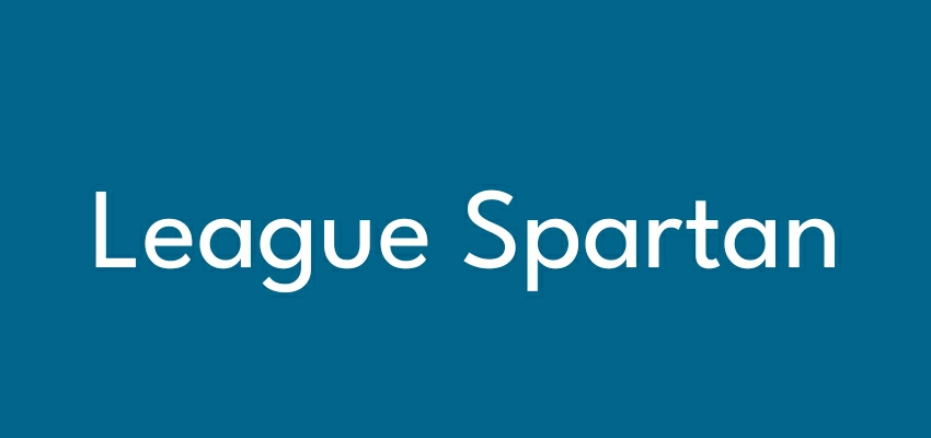
This geometric font makes a strong statement. Its clear letter shapes are easy to read. It’s great for designs with a modern, tech-forward, or startup feel. Use it for eye-catching minimalist flyers that use whitespace and clean lines effectively.
Archivo Black
Archivo Black is bold but not cartoonish. It’s great for headlines that need authority: training programs, services, real estate, and clinics. It keeps the flyer feeling serious while still grabbing attention. Pair with a neutral body font.
Playfair Display
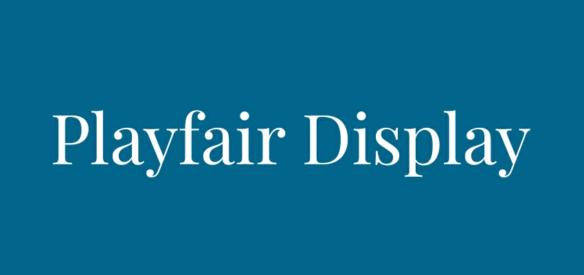
A high-contrast serif that instantly adds “premium” and “editorial” vibes. Use it for fashion, beauty, luxury products, or upscale events. Keep it for headlines only; it can lose readability in small sizes on busy backgrounds.
Best Body Text Fonts for Flyers (clean, readable, reliable)
Inter

Inter is a very dependable font for flyers. It is designed to be clear, so you can easily read details, including dates, locations, and prices. The font looks modern and neutral, allowing it to be easy to pair with almost any headline font.
Roboto
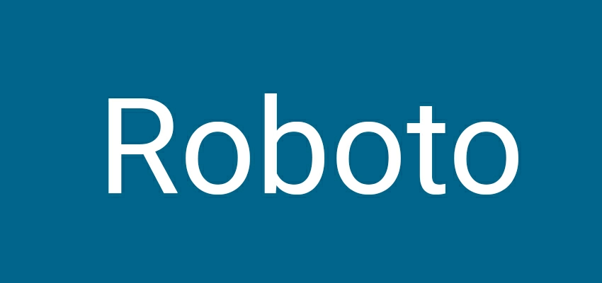
Roboto is a safe workhorse. It’s readable on print and screens, and it stays consistent across different weights. If your flyer includes lots of supporting info (schedule, bullet points, terms), Roboto keeps it neat and calm.
Open Sans
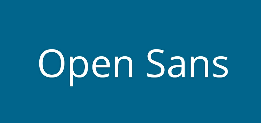
Open Sans is your friendly guide through the written word. Its clean lines and effortless readability make it a perfect companion for longer texts, think flyers and menus. ideal for everyday messages, this typeface adopts simplicity without sacrificing style.
Source Sans 3
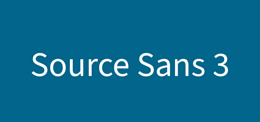
This font is clear and professional, perfect for business use. It works well with serif and sans-serif headlines and is a good choice for presentations and promotions.
Lato

Lato feels warm and modern. Its rounded shapes make it friendly, perfect for gyms, salons, and restaurants, as well as local listings. It’s easy to read, even at small sizes, especially with good line spacing.
Merriweather
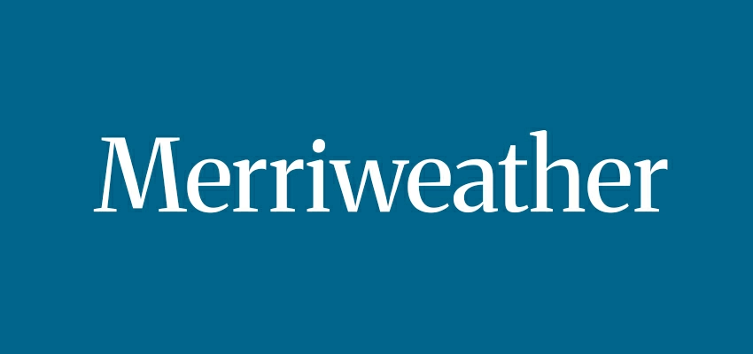
Merriweather is the perfect serif for a timeless touch in body text. Its elegant curves shine for premium services, formal events, and editorial flyers. To ensure readability, always keep contrast high, making words pop on the page.
Best Modern, Clean Fonts for Flyers (minimal, stylish, brand-safe)
Montserrat
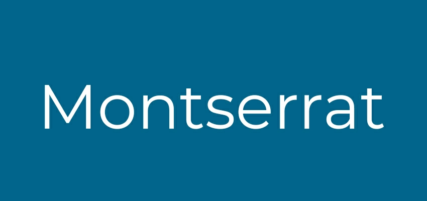
Montserrat is modern and crisp. It works for business and event flyers. Use heavier weights for headlines and lighter weights for subheads. It excels in clean designs.
Poppins

Poppins has a modern, geometric design. It is a good choice for tech, education, and retail flyers because it is easy to read, especially with numbers like prices and dates.
Raleway
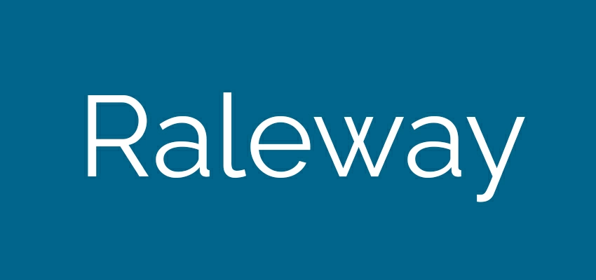
Raleway feels elegant but still modern. It’s best for headlines and short subheads rather than long paragraphs. Use it for boutiques, coffee shops, creative agencies, and modern events. Avoid very thin weights if you’re printing cheaply.
Nunito Sans
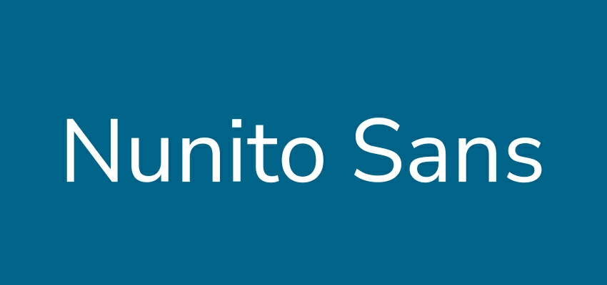
This font is soft, clear, and trustworthy. It works well for service flyers, clinics, schools, and community announcements. The font won’t distract from your headline. It helps your flyer look polished and friendly.
Work Sans
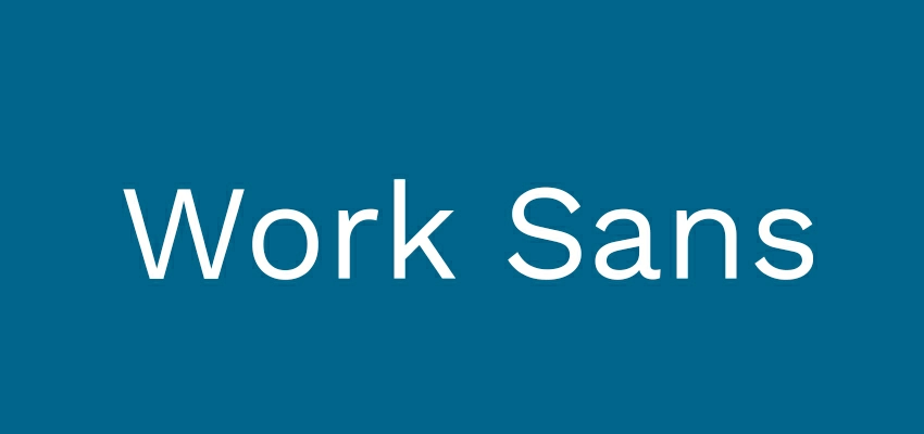
Work Sans is designed for clarity and structure. It shines on flyers with lots of information: schedules, features, packages, or multiple offers. It’s modern, but not trendy. If you want “professional and simple,” this is a smart pick.
DM Sans
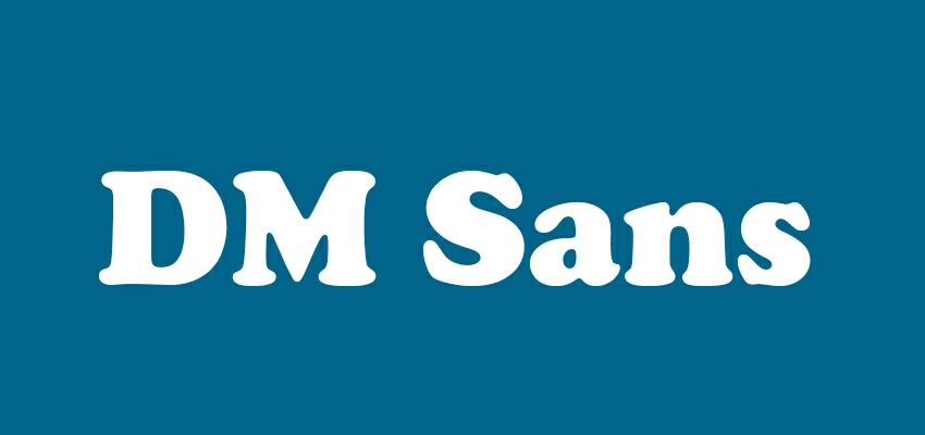
DM Sans has a clean, contemporary feel with just enough personality. It works especially well for digital-first flyers shared on social media and WhatsApp. It stays readable in smaller sizes and pairs easily with bolder headline fonts.
Best Bold Promotional Fonts (sales, urgency, high impact)
Teko
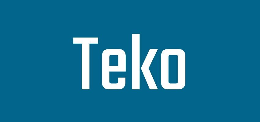
Teko is tall, bold, and built for big promotional headlines. It’s perfect for “50% OFF,” “OPEN NOW,” and strong event titles. Because it’s condensed, you can fit more words without shrinking the headline into unreadable territory.
Black Ops One
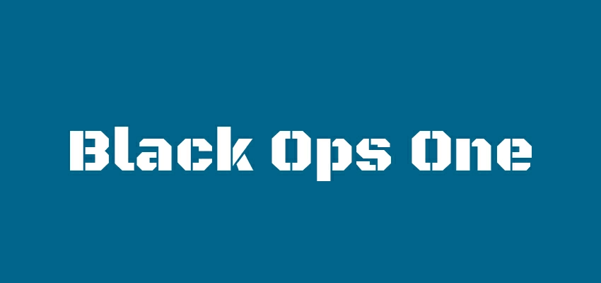
This font is bold, loud, and demanding. Use it for intense flyers: gaming events, fitness challenges, tournaments, or hype-driven launches. Avoid using it too much. One headline is enough.
Bangers
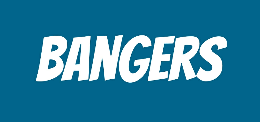
Bangers packs a punch with its comic-style energy, perfect for fun promos, kids’ events, and casual food deals. Playful brands will love its attention-grabbing power. To make it work, balance Bangers with a clean and controlled design on the rest of your flyer, or it may come across as low-budget.
Luckiest Guy
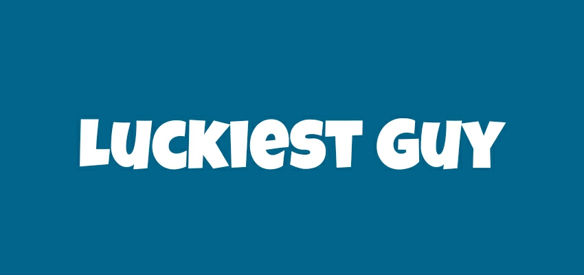
Bold, rounded, and friendly. It’s perfect for flyers that need upbeat excitement: school fairs, family events, entertainment, party nights. Use it for the main headline only, and pair with a clean body font to keep it professional.
Cooper Black
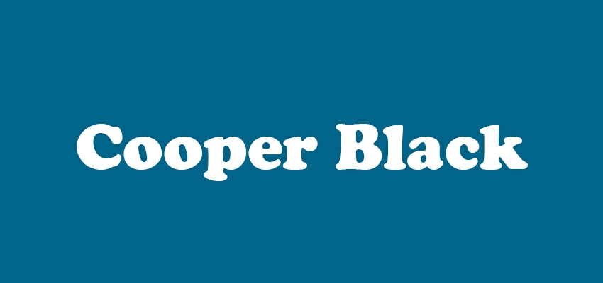
Cooper Black is a confident font that feels familiar. It works well for cafes, vintage events, and lifestyle brands. Give it space to avoid overwhelming the layout.
Impact

Yes, it’s basic. But it’s also effective. Impact works for quick-and-dirty promo flyers where readability matters more than style. If you use it, refine the design around it: clean spacing, strong contrast, and minimal extra fonts.
Best Elegant and Luxury Fonts (premium, high-end, brand-forward)
Bodoni Moda
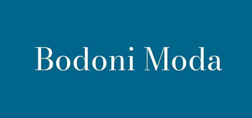
High-contrast and stylish, Bodoni Moda signals luxury fast. Use it for fashion, beauty, premium packaging, and upscale events. It looks best at large headline sizes with plenty of whitespace. Avoid tiny sizes where thin strokes can break.
Didot
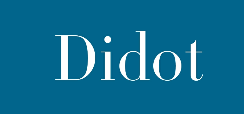
Didot is pure “editorial luxury.” It works best for high-end fashion, jewelry, skincare, and premium launches. Keep backgrounds simple and contrast high. If your printer quality is low, test first. Thin details can fade or look jagged.
Cormorant Garamond

Cormorant Garamond gives a classic look. It works well for premium services and elegant events, and is also good for subheads and short body lines.
Cinzel

Cinzel has a stately, Roman-inspired feel that reads as formal and premium. It fits luxury invitations, awards nights, high-end restaurants, and heritage brands. Use it for headlines or section titles. Pair with a modern sans for body text.
Abril Fatface
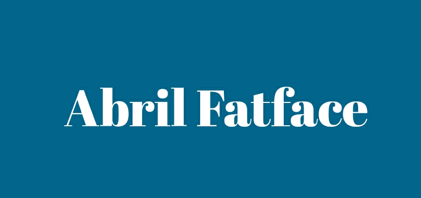
Bold, dramatic, and confident. Abril Fatface is made for headlines that need glamour. It’s great for beauty promos, fashion events, and premium product announcements. Keep supporting text minimal and clean, so the headline feels intentional, not loud.
Libre Baskerville
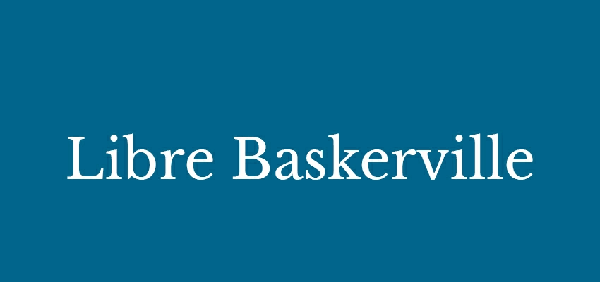
A classic serif that feels trustworthy and upscale without being too fancy. It’s perfect for premium services, real estate, law firms, and formal announcements. It also prints well, making it safer than ultra-thin luxury serifs on average printers.
Fast Font Pairings that Look Good on Flyers
Use one font for headlines and one for body. That’s it. Here are combos that work across most flyer styles:
- Bebas Neue + Inter (events, posters, simple promos)
- Anton + Roboto (discounts, retail, urgent offers)
- League Spartan + DM Sans (modern brands, tech, clean layouts)
- Playfair Display + Source Sans 3 (premium events, beauty, editorial)
- Montserrat + Open Sans (business flyers, services, local ads)
- Cinzel + Work Sans (luxury, formal, heritage)
- Teko + Nunito Sans (big promos with friendly detail text)
- Bodoni Moda + Inter (high-end minimal luxury)
- Cooper Black + Lato (retro lifestyle, cafes, fun promos)
- Oswald + Source Sans 3 (structured informational flyers)
Best Font Picks by Flyer Type (choose without overthinking)
Business / corporate flyers: Montserrat, League Spartan, Source Sans 3, Inter
Event flyers: Bebas Neue, Oswald, Anton, DM Sans
Sales/discount flyers: Teko, Anton, Impact, Roboto
Luxury/fashion flyers: Didot, Bodoni Moda, Playfair Display, Inter
Restaurant/cafe flyers: Cooper Black, Montserrat, Lato, Open Sans
Fitness/sports flyers: Black Ops One, Oswald, Teko, Inter
Community/school flyers: Nunito Sans, Open Sans, Lato, Montserrat
FAQs: Best Font for Flyers
How many fonts should a flyer use?
Two is the sweet spot: one for headlines, one for body. Three can work, but it’s easy to lose consistency and look messy fast.
What font size should I use on print flyers?
As a rule, headlines usually start around 36–72pt, depending on flyer size. Body text often sits around 10–14pt. The real test is printing a draft at actual size.
Are Google Fonts good for professional flyers?
Yes, many are excellent. Montserrat, Inter, Oswald, Bebas Neue, and Source Sans 3 are widely used in real brands. The key is pairing, spacing, and contrast.
Should I use script fonts on flyers?
Only for short accents like a word or two. Scripts can destroy readability, especially from a distance and on textured backgrounds.
What fonts feel “premium” but still readable?
Try Playfair Display, Libre Baskerville, Cormorant Garamond, or Cinzel for headlines. Pair them with Inter, Source Sans 3, or Work Sans for clean details.
What’s the safest all-purpose combo if I’m unsure?
Bebas Neue + Inter for general flyers. Montserrat + Open Sans for business flyers. Bodoni Moda + Inter for luxury flyers.
To Conclude
Select one strong font for headlines and a simple font for the body. Options include Bebas Neue and Inter for events, or Montserrat and Roboto for business.
Test your design at full size before printing. Also, check your font licenses for commercial use. This way, your flyer will look planned, not rushed. Your message gets through quicker, your offers seem trustworthy, and you’ll receive more calls, clicks, and walk-ins today.