Flyer Design Ideas 2026: Trends, Concepts, and Creative Inspiration That Actually Work
People have been saying for over a decade that flyers should be a thing of the past by now. Yet brands are still printing millions of them every year. Not because they’re nostalgic. Because flyers still convert when they’re done right.
In 2026, flyer design isn’t about throwing text on paper. It’s about attention economics. You have seconds, not minutes. One glance, not a deep read.
This guide shows you the latest flyer design trends for 2026. It tells you what’s new, what still works, and how to create flyers that people want to keep.
Key Takeaways
- Flyers still make sense in 2026, but only when they’re clear, simple, and not trying to say too much.
- Clean designs use bold headlines. With breathing room, they are easier to see and understand.
- A good flyer doesn’t end on paper. It nudges people to scan, tap, or visit something online.
- A flyer’s design shows if a brand truly cares about sustainability.
- Printing fewer flyers with a clear purpose works better than flooding people with forgettable ones.
Why Flyer Design Still Matters
Digital ads are crowded. Email inboxes are saturated. Social feeds refresh every second.
A flyer doesn’t compete in the same space. It interrupts differently. In 2026, flyers work best when they’re:
- Hyper-focused
- Visually simple
- Connected to digital experiences
Print isn’t replacing digital. It’s supporting it. Smart brands use flyers to:
- Drive QR-based traffic
- Support local or hyper-targeted campaigns
- Reinforce brand credibility
- Create physical touchpoints in a digital-first funnel
The mistake is treating flyers like mini websites. That approach stopped working years ago.
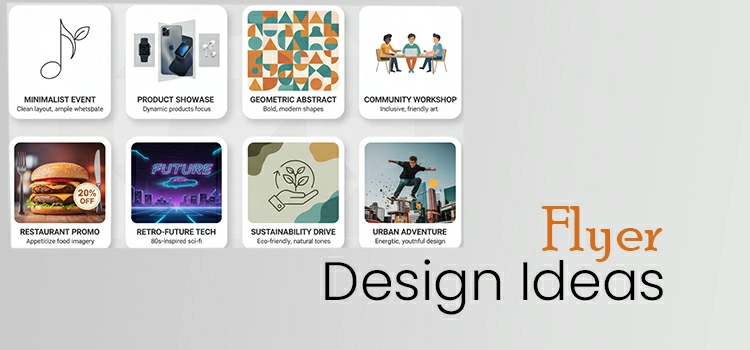
Key Flyer Design Trends Shaping 2026
Flyer design trends in 2026 aren’t flashy for the sake of being trendy. They’re driven by clarity, speed, and personality.
Minimalism With Intent
Minimalism isn’t new. What’s new is purposeful minimalism. Designers are removing anything that doesn’t help conversion:
- No filler text
- No unnecessary icons
- No decorative visuals without meaning
Every element answers one question: Does this help the reader act?
AI-Assisted, Human-Directed Design
AI tools now assist with:
- Layout variations
- Color suggestions
- Image generation
- Typography pairing
But AI doesn’t replace taste. The best flyers in 2026 use AI for speed, then rely on human judgment for:
- Brand alignment
- Emotional tone
- Print feasibility
Sustainability as a Design Constraint
Eco-friendly isn’t just a production choice anymore. It affects design decisions:
- Fewer colors
- Less ink coverage
- Cleaner layouts
- More white space
Typography Trends for Flyers
Typography is doing most of the heavy lifting in modern flyer design.
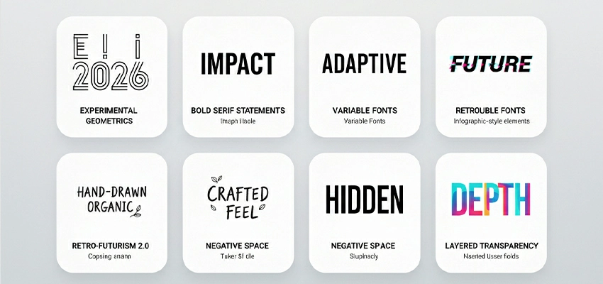
Bold, Oversized Headlines
In 2026, flyers are designed to be read from a distance. That means:
- Larger headlines
- Fewer words
- Strong contrast
Mixed Typeface Systems
Designers are pairing:
- Serif headlines with sans-serif body text
- Humanist fonts with geometric fonts
Humanized Type
Handwritten and imperfect fonts are back, especially for:
- Events
- Local businesses
- Lifestyle brands
Color Palettes That Dominate Flyer Design
Color trends in flyers are becoming more restrained. Loud doesn’t equal effective anymore.
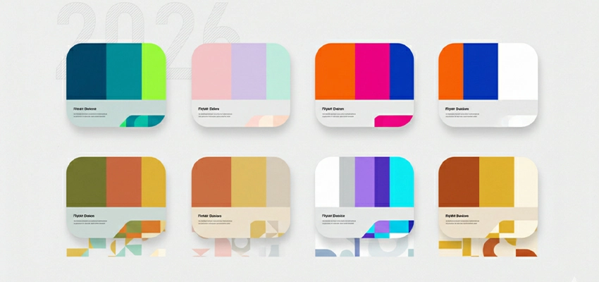
Muted Neutrals With Accent Colors
Expect to see:
- Warm grays
- Soft beiges
- Off-whites
Paired with:
- One strong accent color
- One clear focal point
Earth Tones and Organic Colors
Sustainability influences palette choices:
- Olive
- Clay
- Sand
- Charcoal
Dark Flyers for Premium Brands
Dark backgrounds with light typography are increasingly popular for:
- Luxury brands
- Tech events
- Creative agencies
Layout and Composition Ideas That Convert
Flyer layouts in 2026 are designed to align with scanning behavior. People don’t read flyers. They scan them.
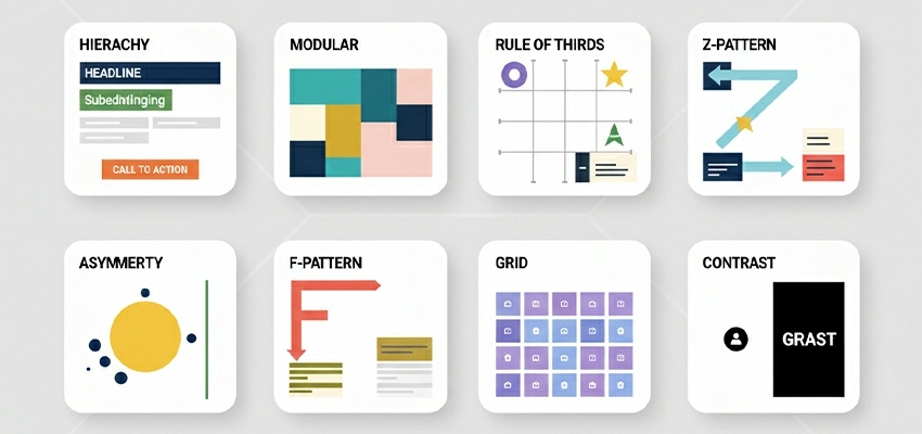
Asymmetrical Layouts
Perfect symmetry feels dated.
Asymmetry:
- Creates visual interest
- Guides the eye
- Feels modern
Vertical Storytelling
Design flows top to bottom:
- Headline
- Visual
- Key benefit
- CTA
White Space as a Feature
White space isn’t empty. It’s breathing room.
More space means:
- Better readability
- Stronger hierarchy
- Higher perceived quality
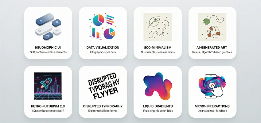
Visual Elements and Graphics in 2026 Flyers
Visuals still grab attention first. But the type of visuals has changed.
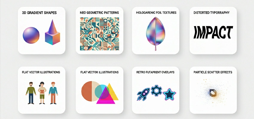
AI-Generated Visuals (Used Carefully)
AI illustrations are common, but overused ones stand out instantly. The best use cases:
- Abstract backgrounds
- Conceptual visuals
- Supporting graphics, not hero images
Real Photography Still Wins
For products, food, people, and real-world services, photography still outperforms illustration. Bad photography kills trust faster than bad typography.
Texture Is Back
Designers are adding:
- Paper grain
- Ink textures
- Halftone effects
Interactive and Smart Flyer Ideas
In 2026, a flyer without a digital connection is a missed opportunity.
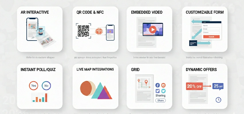
QR Codes as Design Anchors
QR codes aren’t an afterthought anymore. They’re:
- Integrated into layouts
- Styled to match branding
- Positioned as primary CTAs
NFC-Enabled Flyers
More brands are experimenting with NFC for:
- Events
- Product launches
- Premium promotions
AR Flyers
Still niche, but growing. Best used for:
- Real estate previews
- Product demos
- Brand storytelling
Industry-Specific Flyer Design Ideas
One-size-fits-all flyers don’t work anymore.
Retail and Ecommerce
Focus on:
- One product
- One offer
- One action
Events and Promotions
Use:
- Large dates
- Clear locations
- Strong urgency cues
Real Estate
Minimal text. Strong visuals. Trust is the conversion driver here.
Food and Restaurants
Photography matters more than design tricks. If the food doesn’t look good, nothing else matters.
Corporate and B2B
Clean layouts. Clear value propositions. Professionals spot them immediately.
Sustainable and Eco-Friendly Flyer Design Concepts
Eco-friendly design in 2026 is practical, not performative.
Design Choices That Reduce Waste
- Smaller sizes
- Single-sided layouts
- Fewer colors
Messaging Matters
If sustainability is part of your brand, show it:
- Paper choice notes
- Ink disclosures
- Minimalist design language
Print Finishing and Material Trends
Print finishing can elevate or ruin a flyer.
Soft-Touch Lamination
Feels premium. Works best for:
- Luxury
- Tech
- Creative brands
Spot UV (Used Sparingly)
Spot UV is effective when:
- It highlights one element
- It supports hierarchy
Uncoated Stocks
Uncoated paper feels honest and modern.
Perfect for:
- Eco brands
- Editorial-style designs
Die-Cuts and Folds
Creative formats work when they support the message, not distract from it.
Common Flyer Design Mistakes to Avoid
These mistakes still kill flyers every year:
- Too much text
- Weak or unclear CTA
- Poor contrast
- Ignoring print bleed and margins
- Designing for screen, not print
How to Design a High-Converting Flyer
Here’s the simple framework:
- One goal
- One message
- One action
Focus on Hierarchy
If everything looks important, nothing is.
Use One Strong CTA
“Scan to order.” “Visit today.” “Register now.” Clarity beats creativity here.
Test Before Printing
Print a small batch. Review it physically. Screen previews lie.
The Future of Flyer Design Beyond 2026
Flyer design won’t disappear after 2026. It will shrink in volume and grow in impact. The future isn’t about printing more flyers. It’s about printing smarter flyers.
Beyond 2026, flyer design will move toward precision marketing. Instead of mass distribution, brands will focus on targeted, data-informed print. Fewer locations. Better timing. Clearer intent. A flyer handed to the right person still beats a digital ad shown to the wrong one.
Personalization will also scale. Variable data printing will become more accessible, allowing brands to customize flyers by:
- Location
- Event type
- Customer segment
- Even previous buying behavior
This doesn’t mean every flyer will be unique. It means relevance will increase, and irrelevant print will fade out.
Design-wise, flyers will continue moving toward simplicity. Expect:
- More white space
- Fewer colors
- Stronger typography-led layouts
As AI-generated content grows, physical design will become more human. Texture, imperfections, and tactile materials will matter more. People trust what feels real.
Flyers will connect print and digital. They will use QR codes, NFC, and short links to track engagement. The biggest change? Flyers will no longer be standalone pieces. They will now serve as conversion touchpoints within larger systems.
FAQs About Flyer Design
Are flyers still effective in 2026?
Well-designed flyers drive results, but generic ones do not.
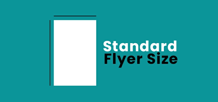
What flyer size works best in 2026?
A5 and DL flyer sizes are popular for handouts because they are cost-effective.
Should flyers be print-only or digital-friendly?
Make them digital-friendly. Flyers perform best with landing pages, forms, or tracking links.
How much text should a flyer include?
Stick to one headline, one supporting line, and a clear call to action. More text makes it feel like a brochure.
Are QR codes still relevant?
Use visible and easy-to-scan QR codes. Avoid making them too small.
How much does flyer design cost in 2026?
Poor design increases costs over time. Good design boosts action and saves money.
What’s the biggest flyer design mistake today?
Trying to say too much. Flyers succeed when they do one job well, not multiple jobs poorly.
Final Thoughts
Flyers aren’t outdated. Bad flyer design is. In 2026, the best flyers are:
- Simple
- Focused
- Purpose-driven
- Connected to digital journeys
If your flyer can’t explain itself in three seconds, redesign it. If it doesn’t guide action, simplify it.
Print still works. You just have to respect how people actually consume it.